The Friend Digital Messaging Internship

From April to December of 2024, I was the Friend Digital Messaging Intern for the Church of Jesus Christ of Latter-day Saints.

Traditionally, a Church Magazine internship is four months long. Because of my experience and the needs of the office, my internship was extended for the 2024 year. I was responsible for assisting with the direction of and creating print and digital content for the global Friend magazine.
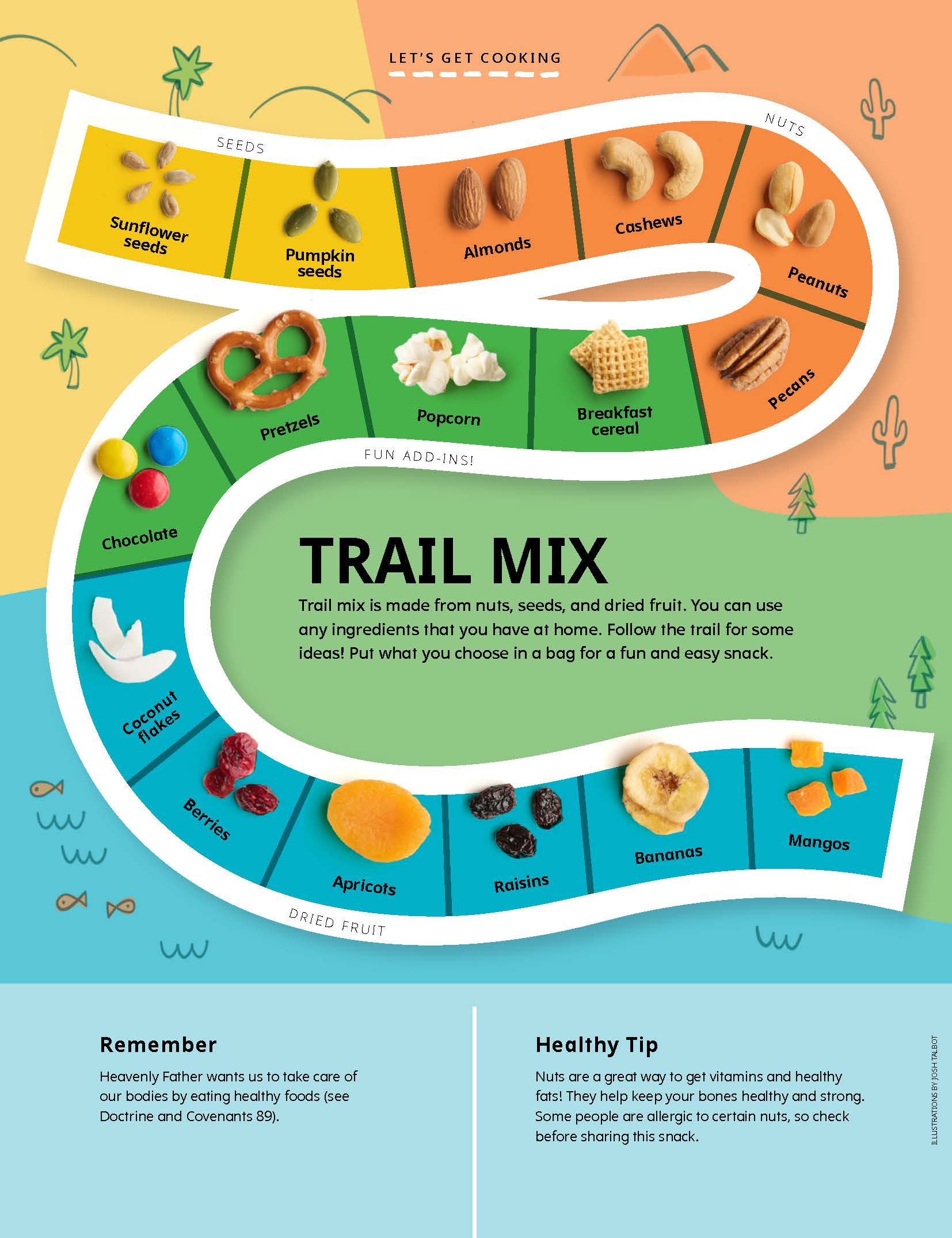
Editorial

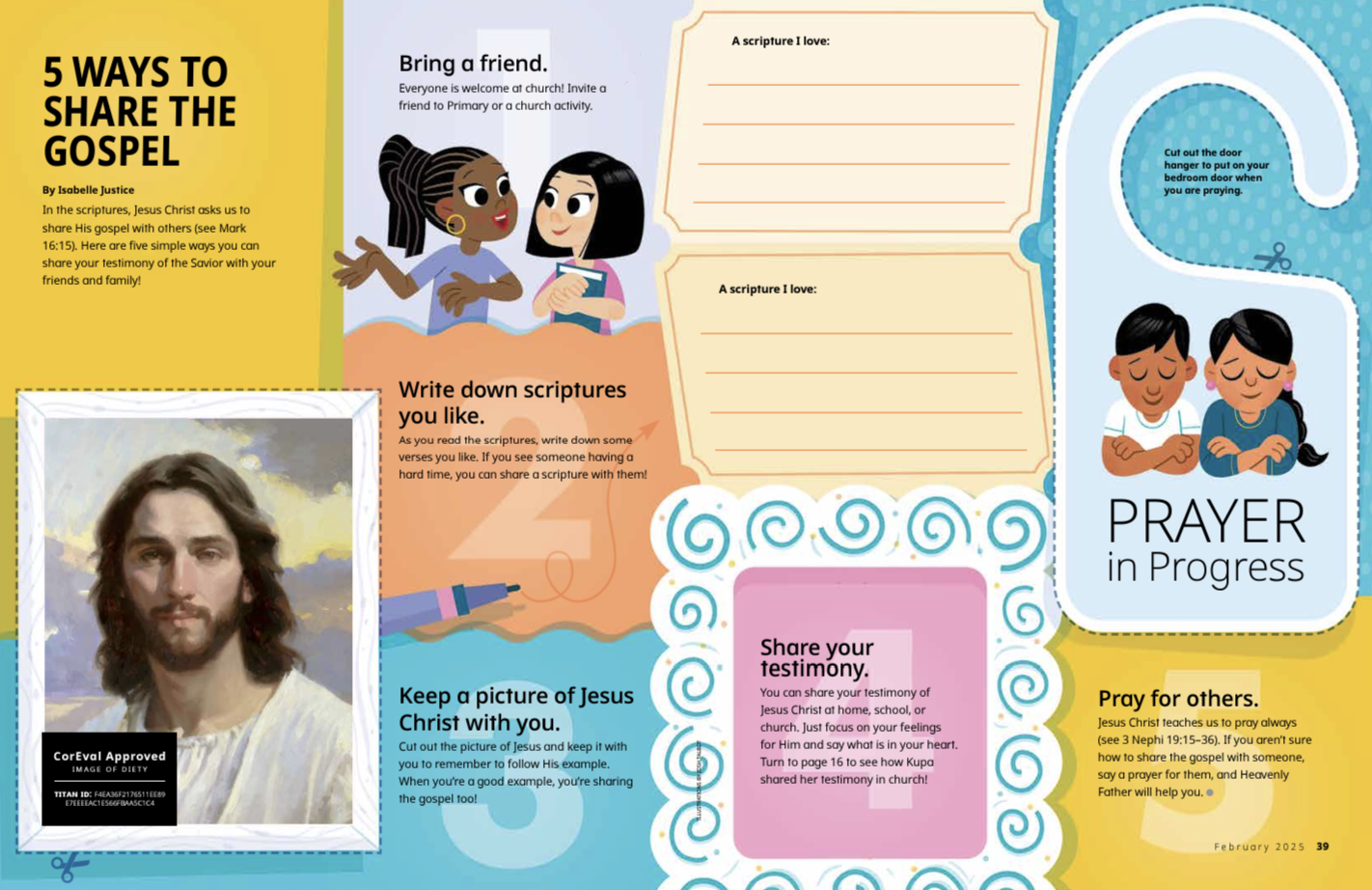
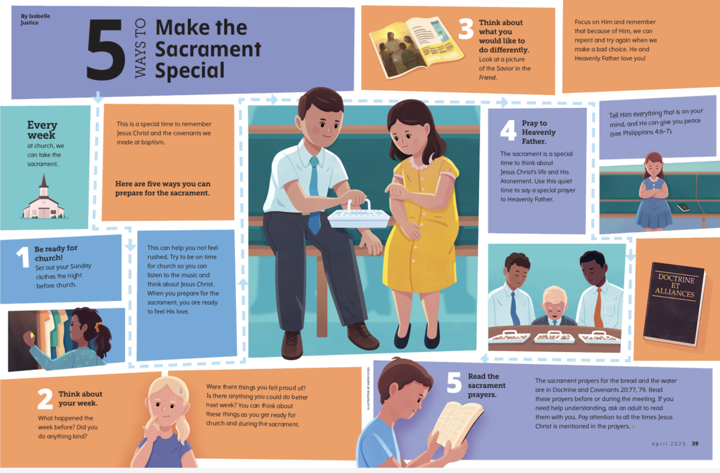
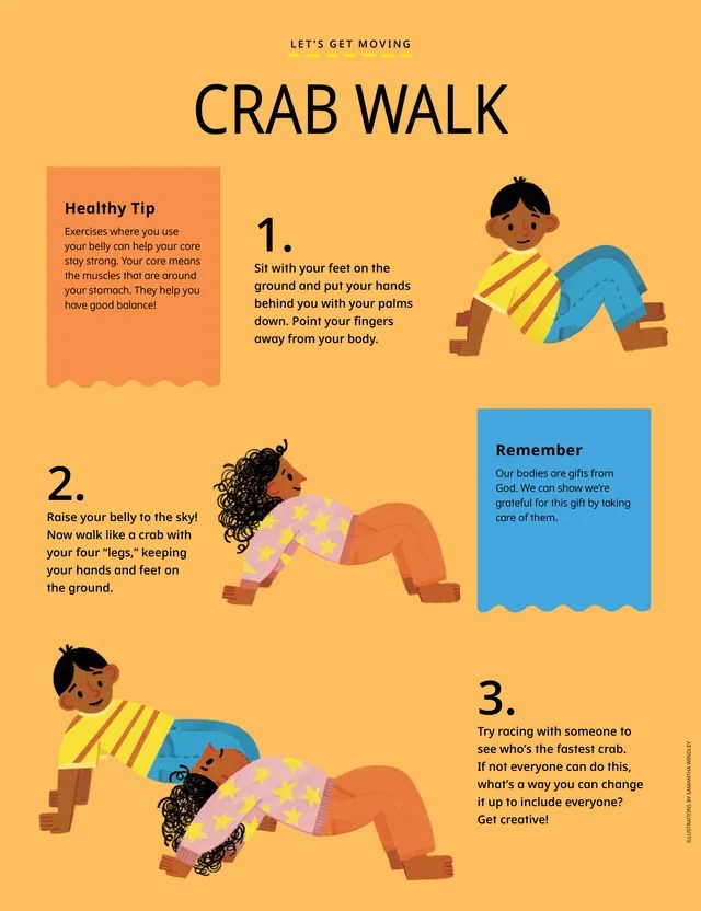
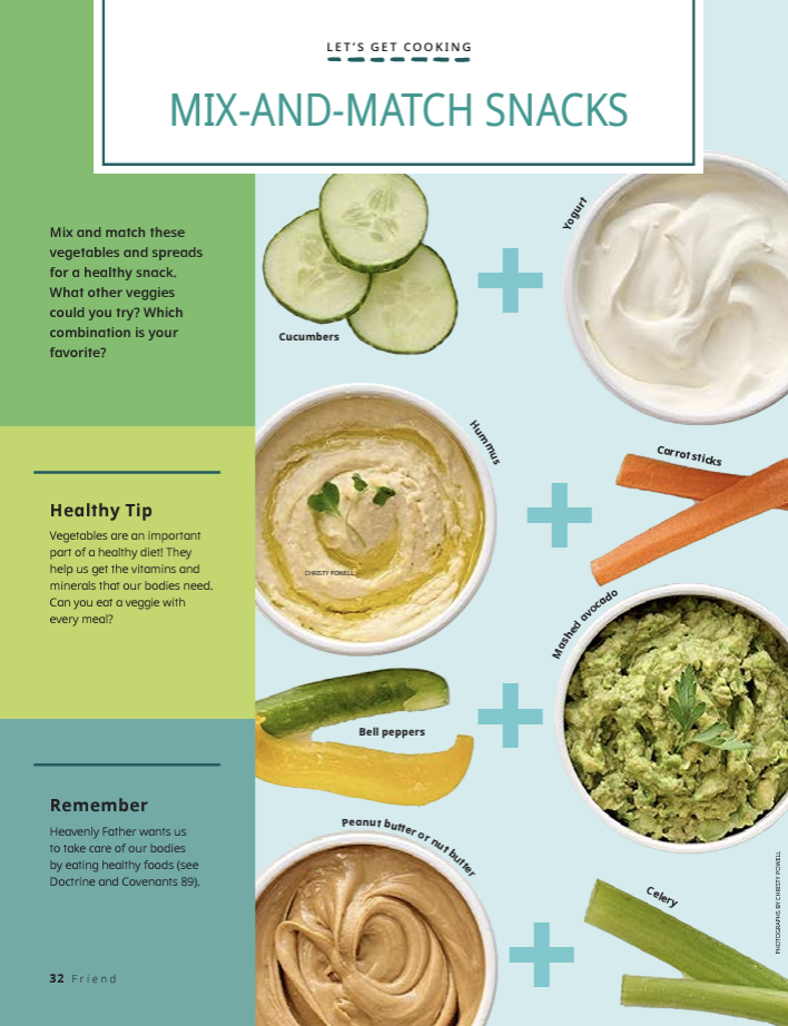
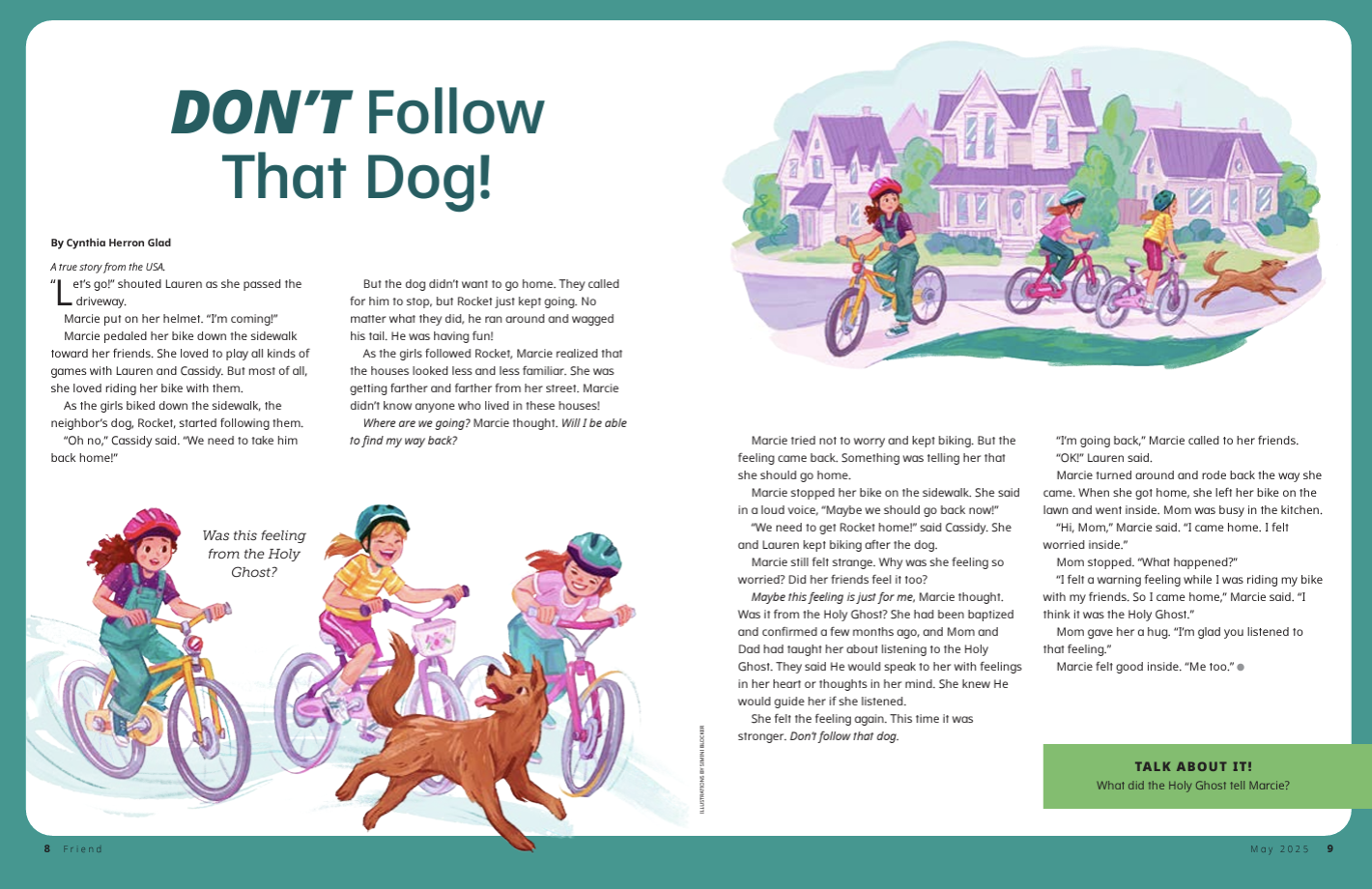
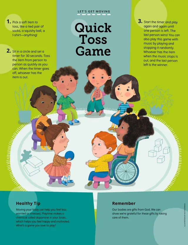
I wrote 22 articles for the Friend and was a peer editor for all monthly content. I was also in charge of the Let’s Get Cooking and Let’s Get Moving departments, where I wrote all articles for the 2025 year, except for January 2025.

Due to the Church’s advanced publication schedule, many of my articles are not yet online. More information about my writing in this position can be made available upon request.

Friend Emails

Check out emails I’ve written for the Friend below.

Digital

I wrote Instagram and Facebook captions for the Friend social media accounts and created the social media content calendar. I assisted with over 60 social media posts and worked closely with Church magazine social media managers, graphic designers, and animators to ensure all content was up to standard. I filmed multiple videos for Church magazine accounts, one of which received over 420k views!

Temple Preparation Reel

I conducted several A/B tests with social media captions and followed patterns of which content performed the best. I also led the “Turning 12” campaign, which prepared Latter-day Saint youth to enter the temple and join the youth programs.

See videos that I filmed for the Liahona, YA Weekly, and Friend Instagrams here!

YA Weekly

During my internship with the Friend, I regularly contributed to YA Weekly, writing articles every other month and frequently peer editing content. Prior to that, I was the YA Weekly editorial intern. You can view more of my work for YA Weekly here.

Create an Advertisement: In the Fast Lane

Ad Campaign Presentation

For a school assignment, I was asked to create an advertisement. I wanted to choose an advertisement for something that I was interested in and had ties to. What better way to accomplish this than an advertisement for Harley riders, being that my parents are avid Harley fans?

I did a quick Google Image search and this was the ad that popped up. The Creative Circus, an art college in Atlanta, Georgia, created an ad campaign for Harley Davidson, focusing on motorcyclist women, self care and the freedom that comes with the sport. They had two other ads that went cohesively with the original photo, but did not include a motorcycle. That is where my inspiration came in.

Original Ad Analysis

There are so many design elements that I love about this advertisement. The first arrow shows contrast because of the black shadow, grey background and blue road. The black sticks out from the blue and draws your eyes to the woman. There is also contrast among the black and white boxes lining the top and bottom.

The second arrows points to repetition, where the same fonts are used to get the ad’s point across.

The third arrows reference proximity. The main focus of the ad is to “accelerate” and the descriptive text is right aligned and in a smaller font, showing that it is less important.

The fourth arrow points to the logo and refers to proximity. This is because the logo is important, otherwise it would be hard to know what the ad is for. However, it is not the most important part of the piece, the female motorcyclist is.

I also love the color choices of “Inhale. Exhale. Accelerate.” The “Accelerate.” is the classic Harley Davidson orange, and I think the blue and greens blended together well with the color of the motorcyclist, road and background. I also enjoyed the typography of “Accelerate.” because it is slightly italicized compared to the first two words. I love how there was only a stroke for the text because it shows off the photography well.

New Advertisement

For my Campaign Ad, I wanted to do another female motorcyclist ad. I flipped the photo to face the opposite direction and incorporated colors of purple and maroon with hints of light blue rather than the blue and grey combo from the original ad. Arrow 1 shows contrast. I edited the photo’s colors to make the woman a dark maroon to pop out from the light background. Arrow 2 points to repetition. I made opaque boxes overlapping each other for the design aspect. I added it to the bottom right corner to create flow in the photo. I use Harley Davidson orange for this design. Arrow three points to alignment. The tagline was left aligned and I made the top line bigger than the bottom because that was the main message I wanted to portray. Arrow 4 points to the logo and refers to proximity of the logo. Like the original ad, the logo was important but the main focus is the motorcyclist so it was left aligned to the bottom. Typography wise, I created a darker shadow for the bottom line, creatine dimension.

Conclusion

At the end of the day, I wanted these two ads to be cohesive without copying each other. I think the color choices are similar but different enough to be two different advertisements. I enjoyed playing with the colors of my original photos as well was creating background designs in Illustrator. I love the company as well as the message of the ads.