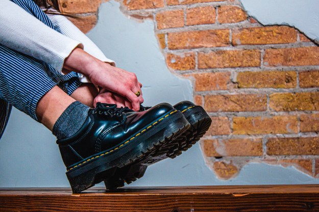
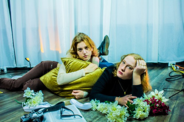
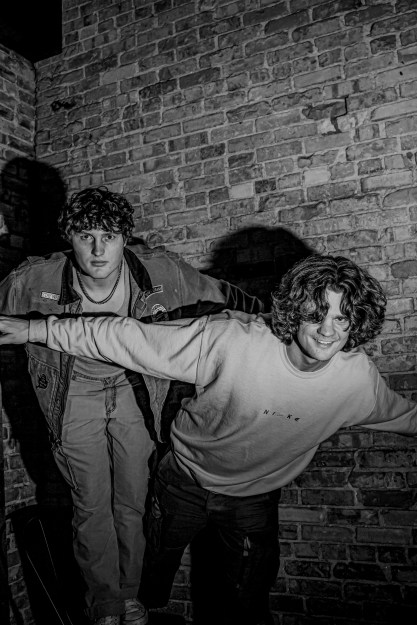
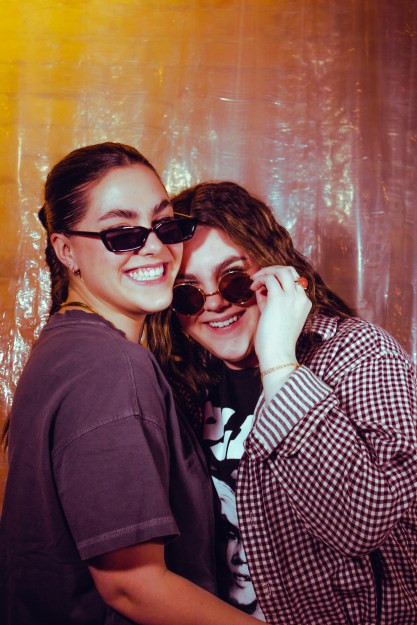
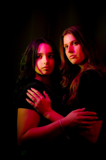
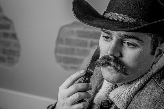
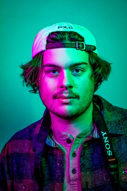
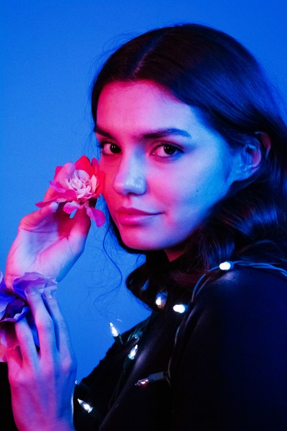
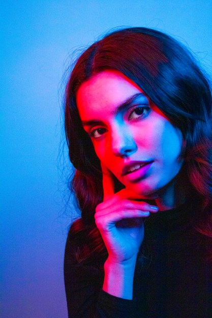
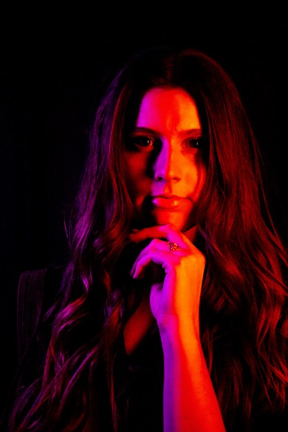
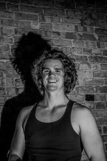
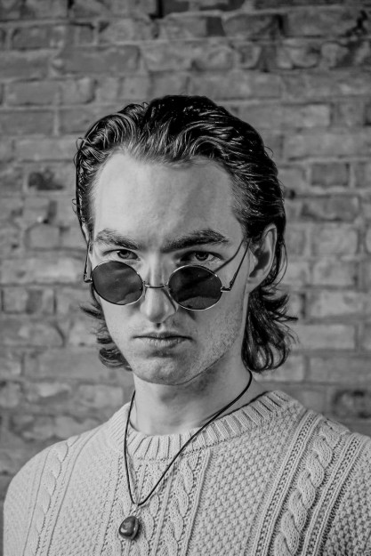
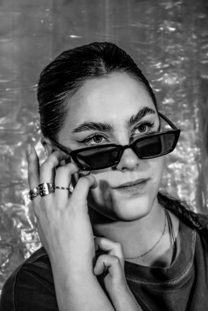
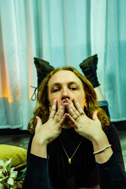
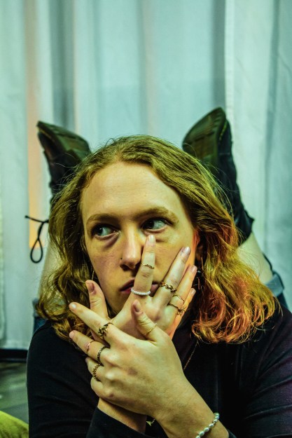
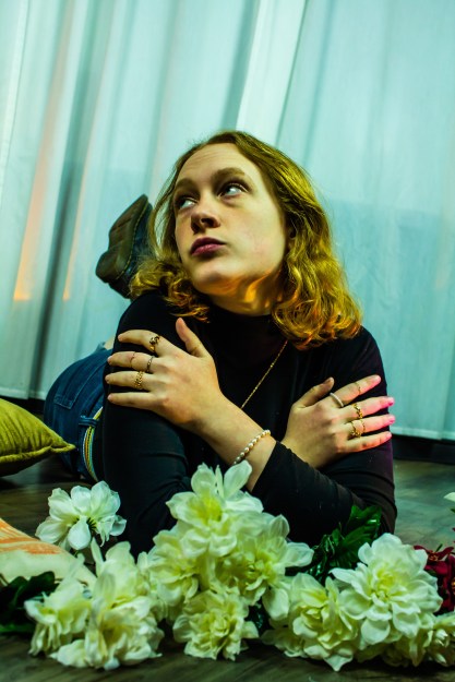
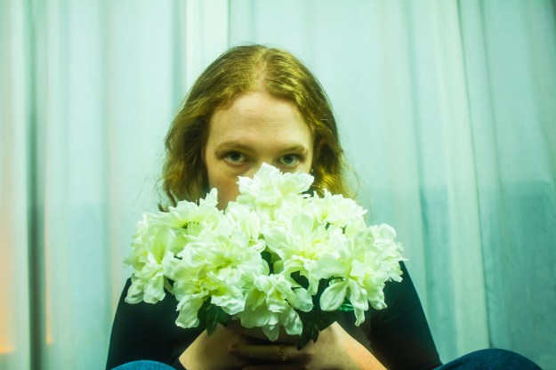
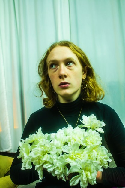
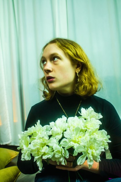
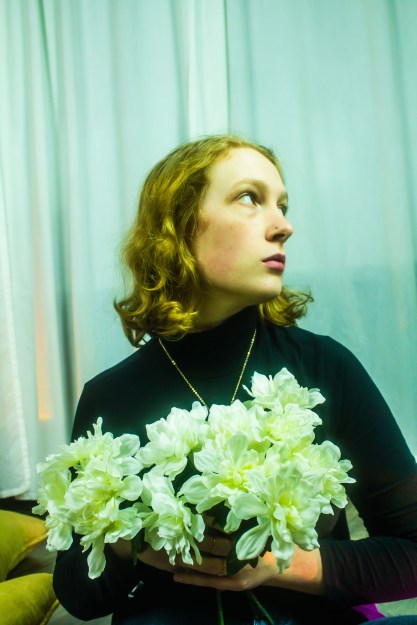
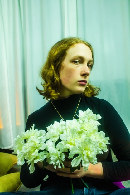
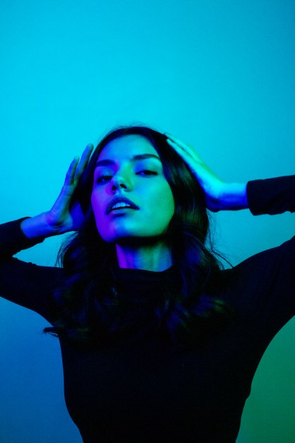
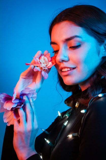
As part of Caryn Esplin’s photography course, we planned and participated in a fashion photoshoot. I had the privilege to take photos of nine talented female models and six wonderful male models. We covered portraits for men and women, as well as accessory and group photography.
Tag: photoshop


Ordinary Spot, Extraordinary Shot!
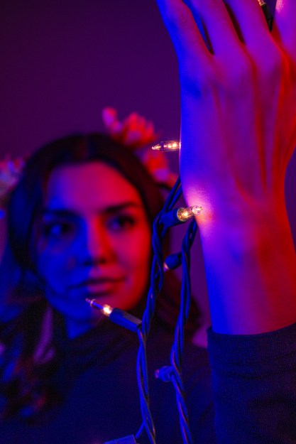
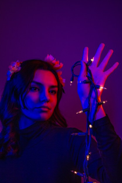
For our first photography assignment, I wanted to apply my creativity with the things I already have. In a world saturated with advertisements, media and easy ways to spend money, we can forget to be grateful for the things we already have. For my OSES project, I wanted to apply just that.
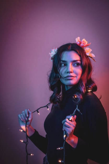
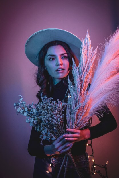
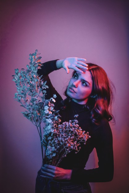
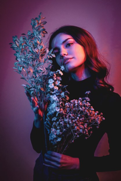
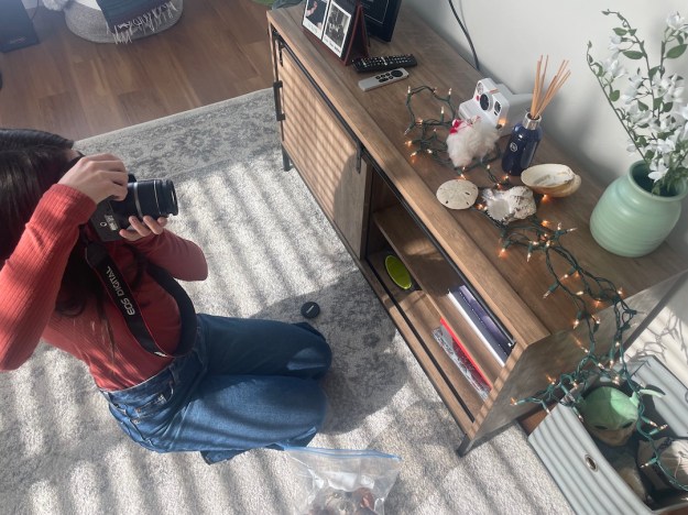
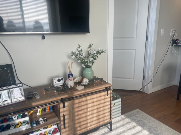
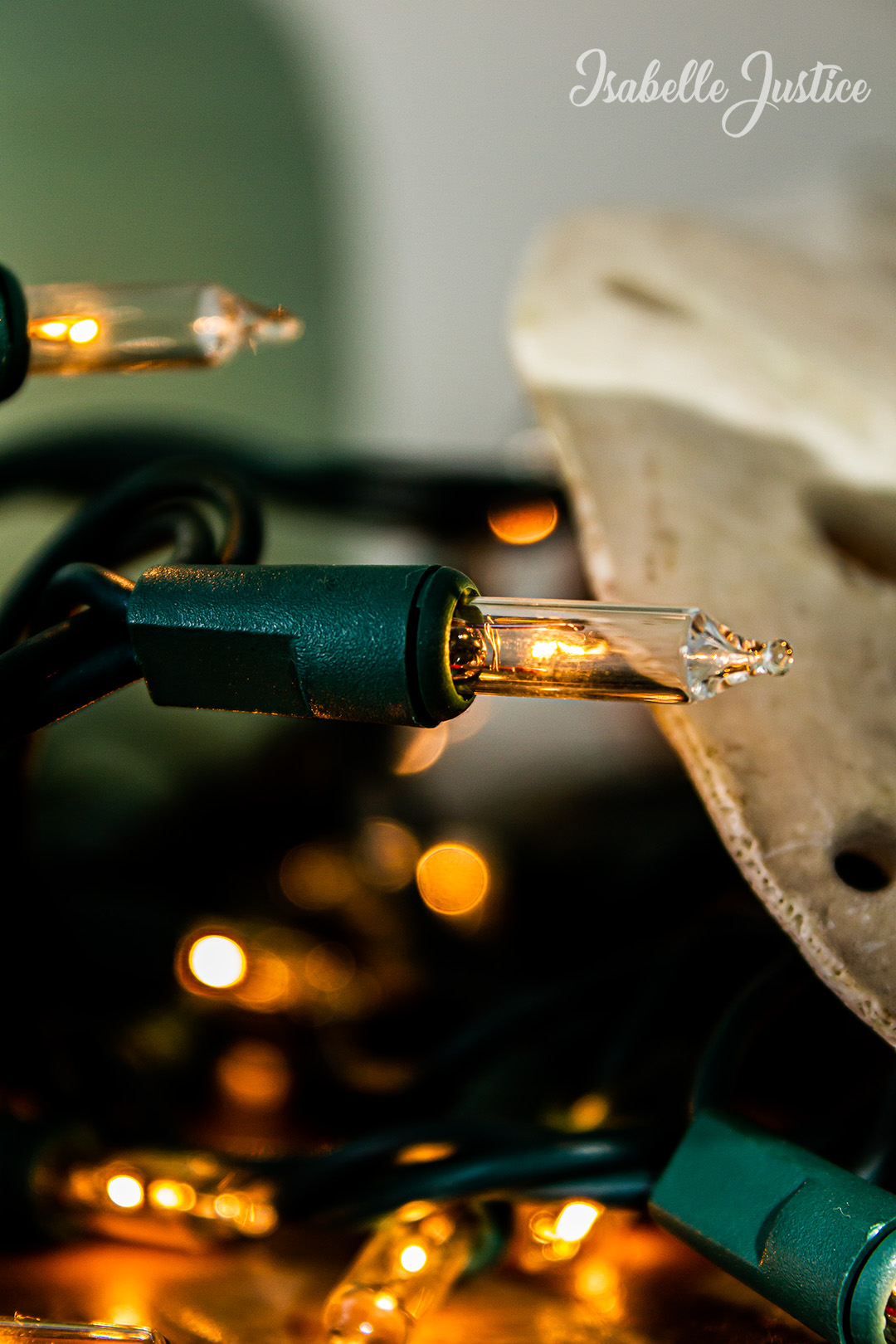
For those who don’t know, OSES stands for “Ordinary Spot, Extraordinary Shot”. This means taking your photos in an “ordinary” or boring spot and making them spectacular. With Christmas just last month, I still had some flashing lights I had in mind to use as props. Over the summer, my family and I went to Mexico and collected seashells. With the treasures I already had in my home, plus other knick-knacks, I could make an ordinary spot in my apartment extraordinary.
Original Set-Up & Editing
The editing process was rather simple! I used sliders in Camera Raw, such as temperature, exposure, contrast, highlights, shadows, textures and clarity. I took things a step further into Photoshop by dodging and burning and applying a final “Levels” filter. I also applied “Smart Sharpen” and my watermark.
Photo 1


Photo 2

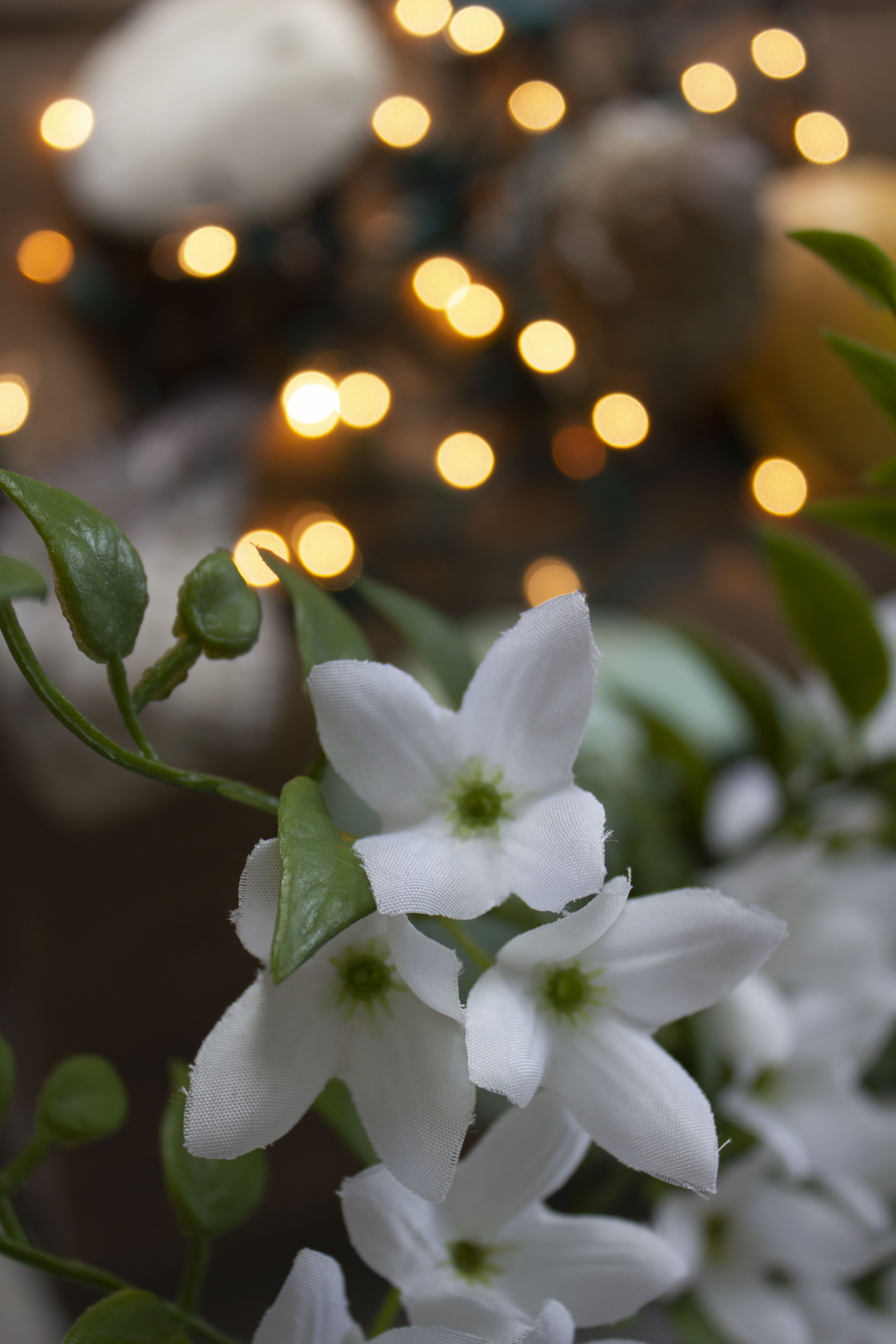
Photo 3


Photo 4

Instagram Post
Printed Fine Art Photography
This semester I have grown so much. At the beginning of this course, I didn’t even know what aperture or ISO was. After studying how a camera works and personally testing it out for myself, I have become really proud of my work.
For my 16×24 Fine Art print,
I chose two photos.
The first photo I chose was of a beautiful mustang named Maserati. He was part of the Bannack, Montana photo excursion I was able to go on. When editing this, I really wanted to accentuate the texture of his hair and his aging spots. Sister Esplin gave a personalized workshop for the Digital Imaging students and she helped me understand how to do this in Photoshop. After she helped me, I made some adjustments myself. I used a lot of masks and used adjustments such as sharpening, Camera Raw filters, gaussian blur, and levels.

Below is the original image.

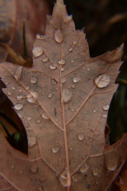
The next photo I chose to print was of my macro leaf shots. This was actually an in-class activity where props were brought into class for us to take photos of. The leaves outside were beautiful and I wasn’t impressed with how these macro shots were turning out. I decided to go outside ad try things from a new perspective. After Sister Esplin showed me some tips in Photoshop, I wanted to apply this for myself. So, for this photo, I used a Camera Raw filter, a sharpen mask, a gaussian blur mask, level adjustments, and the healing tool to cover up distracting holes in the leaf.
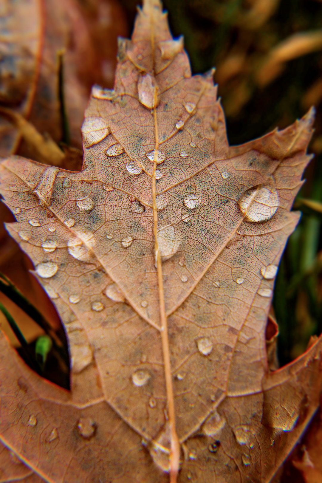
Below is the original image.
Create an Advertisement: In the Fast Lane
Ad Campaign Presentation
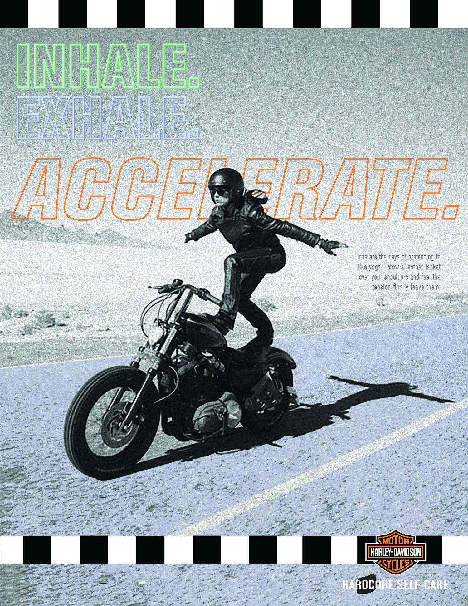
For a school assignment, I was asked to create an advertisement. I wanted to choose an advertisement for something that I was interested in and had ties to. What better way to accomplish this than an advertisement for Harley riders, being that my parents are avid Harley fans?
I did a quick Google Image search and this was the ad that popped up. The Creative Circus, an art college in Atlanta, Georgia, created an ad campaign for Harley Davidson, focusing on motorcyclist women, self care and the freedom that comes with the sport. They had two other ads that went cohesively with the original photo, but did not include a motorcycle. That is where my inspiration came in.
Original Ad Analysis
There are so many design elements that I love about this advertisement. The first arrow shows contrast because of the black shadow, grey background and blue road. The black sticks out from the blue and draws your eyes to the woman. There is also contrast among the black and white boxes lining the top and bottom.
The second arrows points to repetition, where the same fonts are used to get the ad’s point across.
The third arrows reference proximity. The main focus of the ad is to “accelerate” and the descriptive text is right aligned and in a smaller font, showing that it is less important.
The fourth arrow points to the logo and refers to proximity. This is because the logo is important, otherwise it would be hard to know what the ad is for. However, it is not the most important part of the piece, the female motorcyclist is.
I also love the color choices of “Inhale. Exhale. Accelerate.” The “Accelerate.” is the classic Harley Davidson orange, and I think the blue and greens blended together well with the color of the motorcyclist, road and background. I also enjoyed the typography of “Accelerate.” because it is slightly italicized compared to the first two words. I love how there was only a stroke for the text because it shows off the photography well.
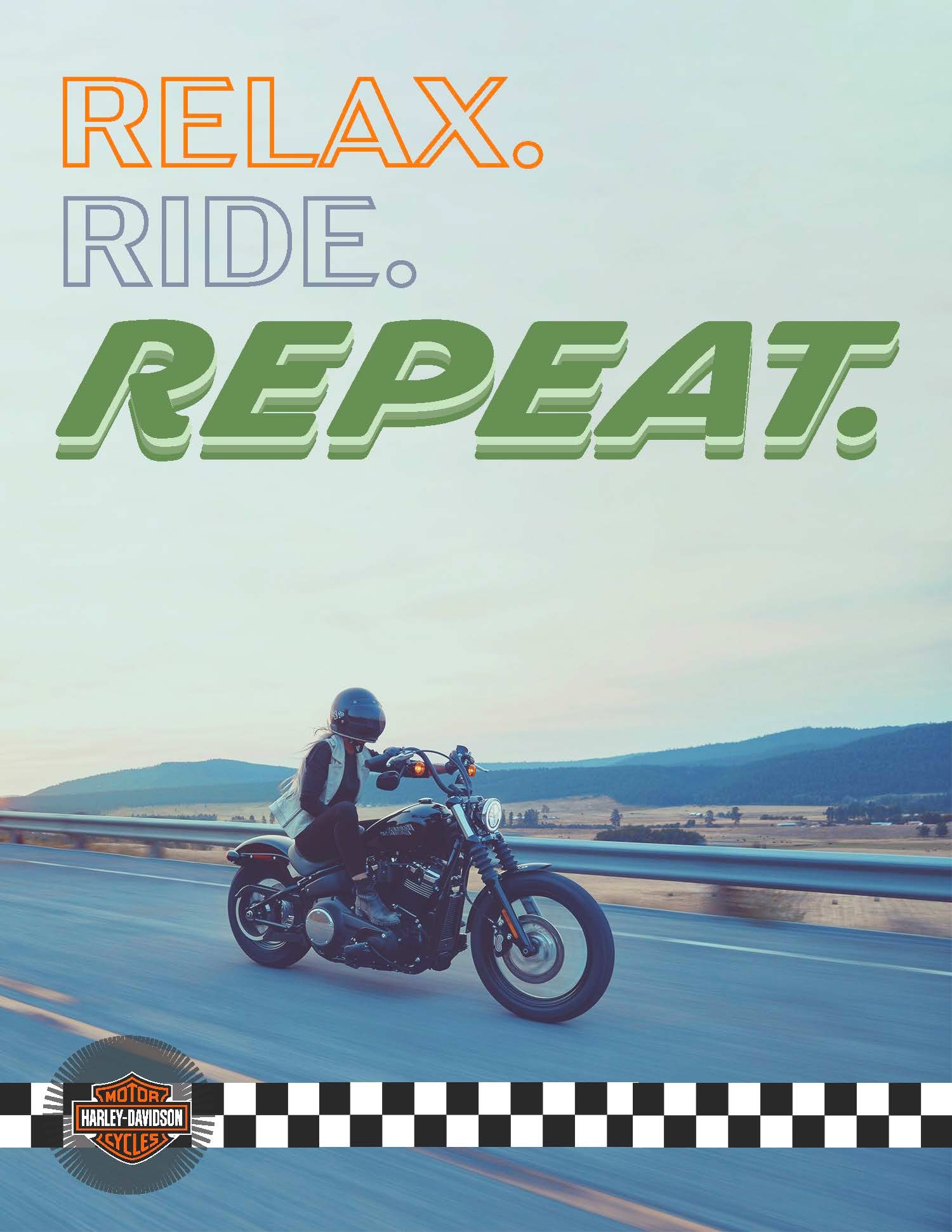
New Advertisement
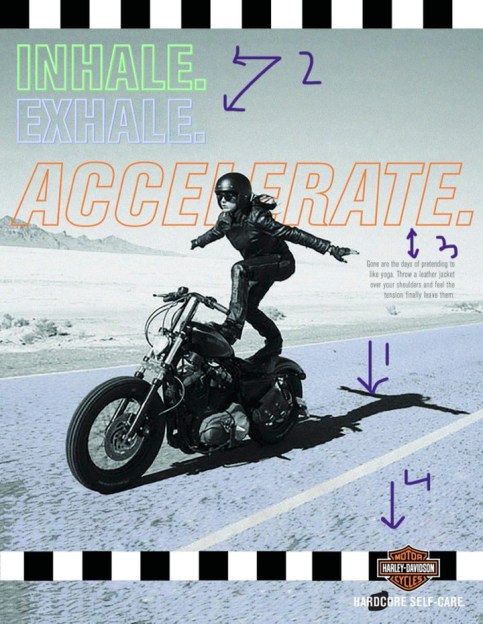
For my Campaign Ad, I wanted to do another female motorcyclist ad. I flipped the photo to face the opposite direction and incorporated colors of purple and maroon with hints of light blue rather than the blue and grey combo from the original ad. Arrow 1 shows contrast. I edited the photo’s colors to make the woman a dark maroon to pop out from the light background. Arrow 2 points to repetition. I made opaque boxes overlapping each other for the design aspect. I added it to the bottom right corner to create flow in the photo. I use Harley Davidson orange for this design. Arrow three points to alignment. The tagline was left aligned and I made the top line bigger than the bottom because that was the main message I wanted to portray. Arrow 4 points to the logo and refers to proximity of the logo. Like the original ad, the logo was important but the main focus is the motorcyclist so it was left aligned to the bottom. Typography wise, I created a darker shadow for the bottom line, creatine dimension.
Conclusion
At the end of the day, I wanted these two ads to be cohesive without copying each other. I think the color choices are similar but different enough to be two different advertisements. I enjoyed playing with the colors of my original photos as well was creating background designs in Illustrator. I love the company as well as the message of the ads.
