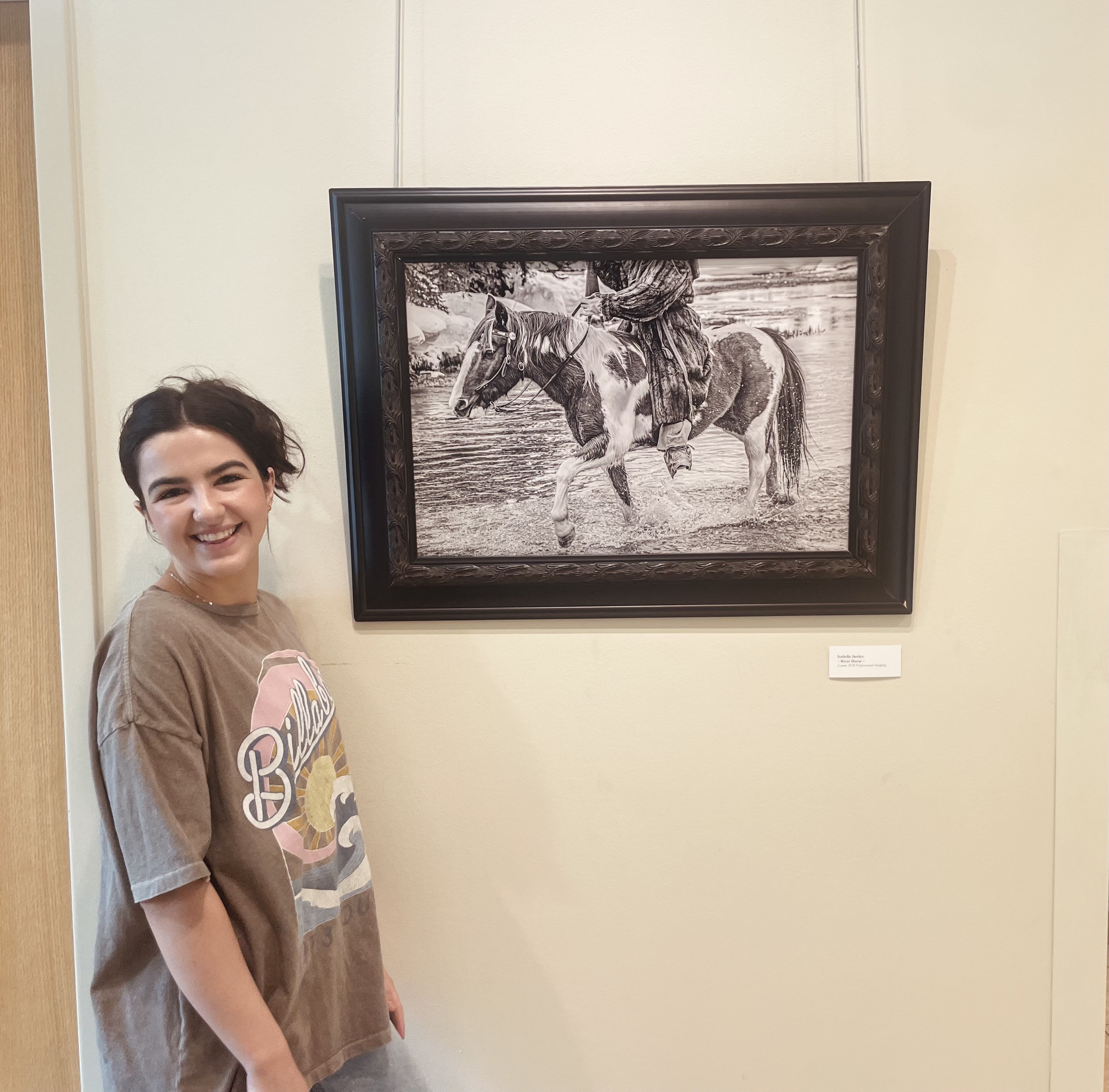
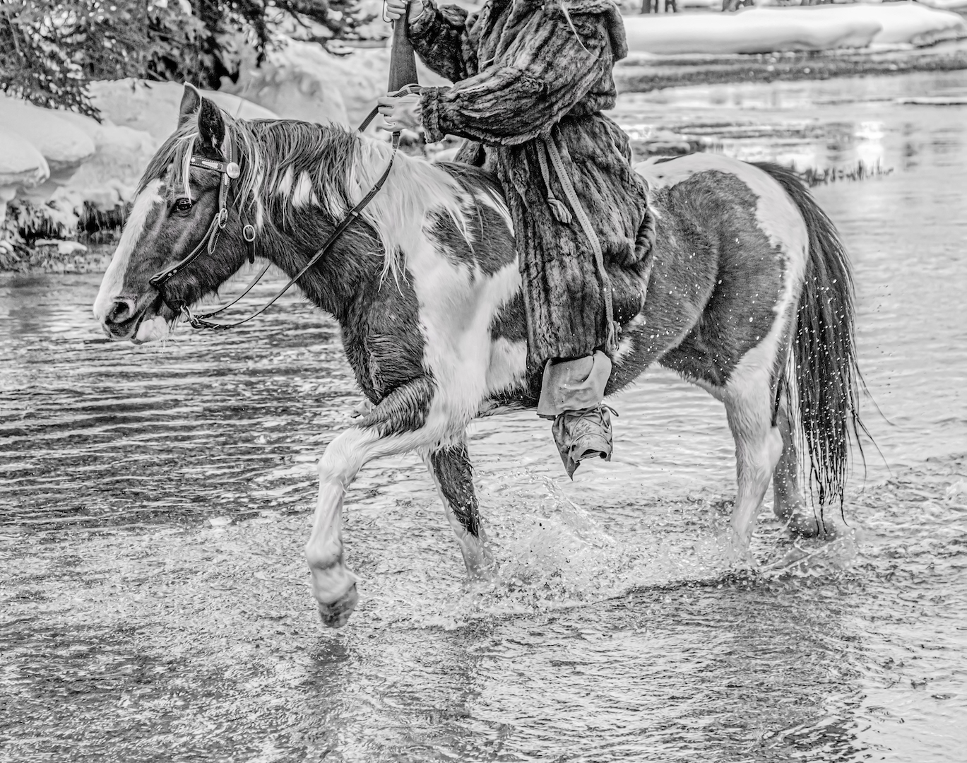
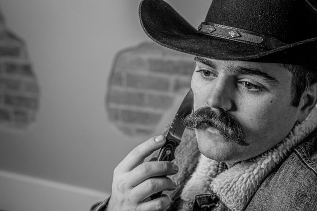
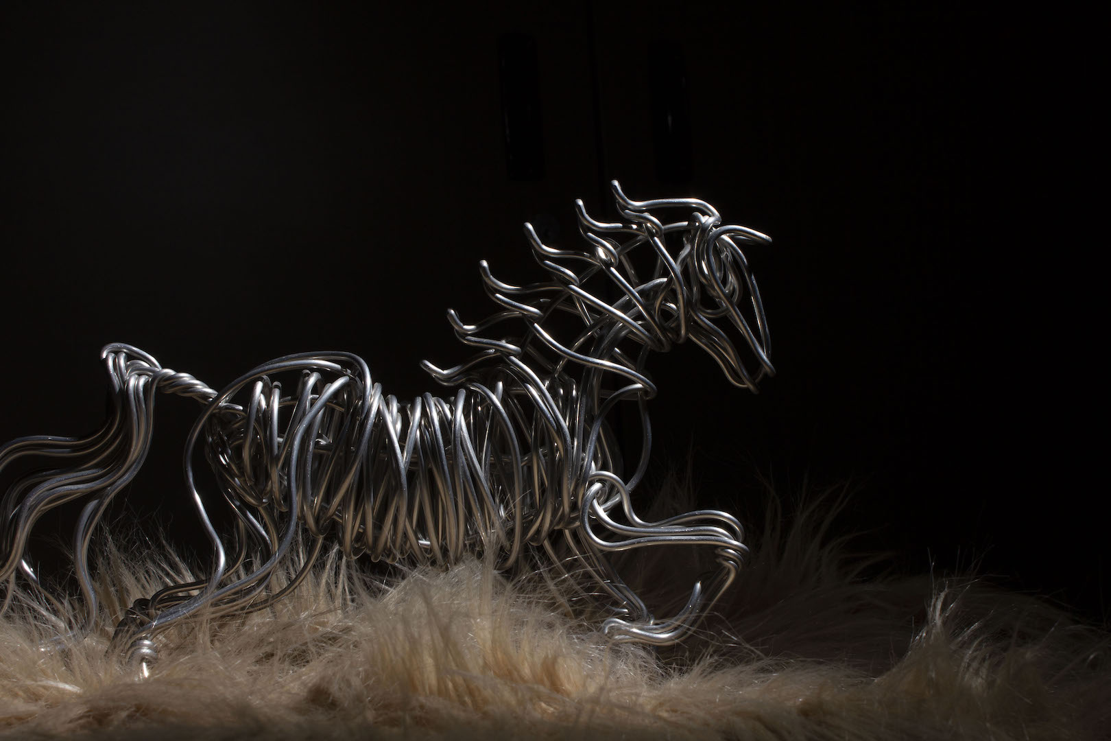
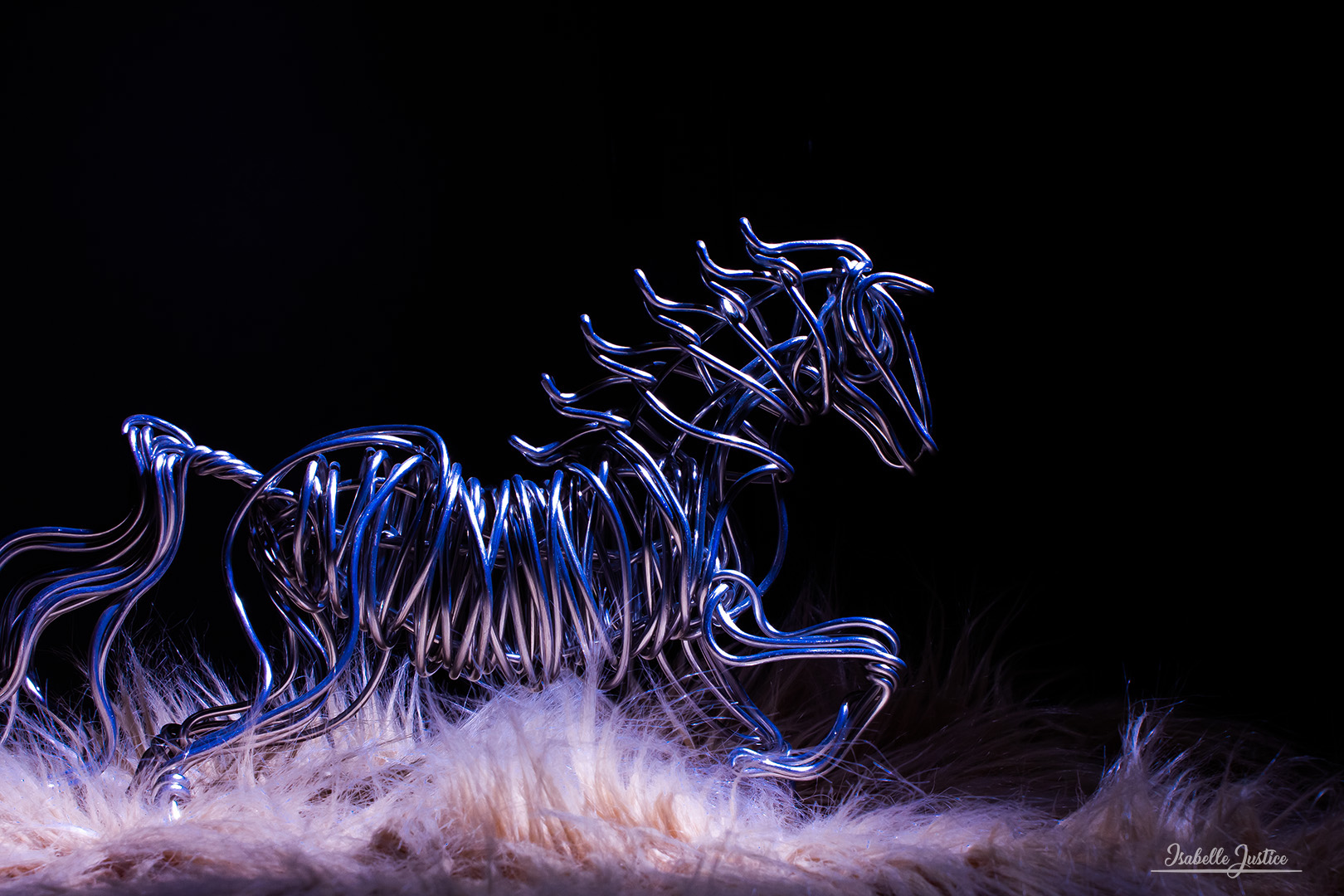
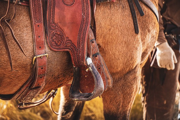
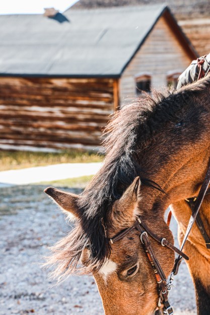
This photo was taken in Island Park, Idaho in February of 2023. The editing process included switching the photo to monochrome in Adobe Camera Raw and doing simple edits there, such as increasing the contrast, texture, and exposure. I sharpened the image and then used noise reduction.
In Photoshop, I used dodging and burning to highlight the horse’s eyes, hair, and hooves. I used this technique to bring dimension to any parts of the photo that were blown out.
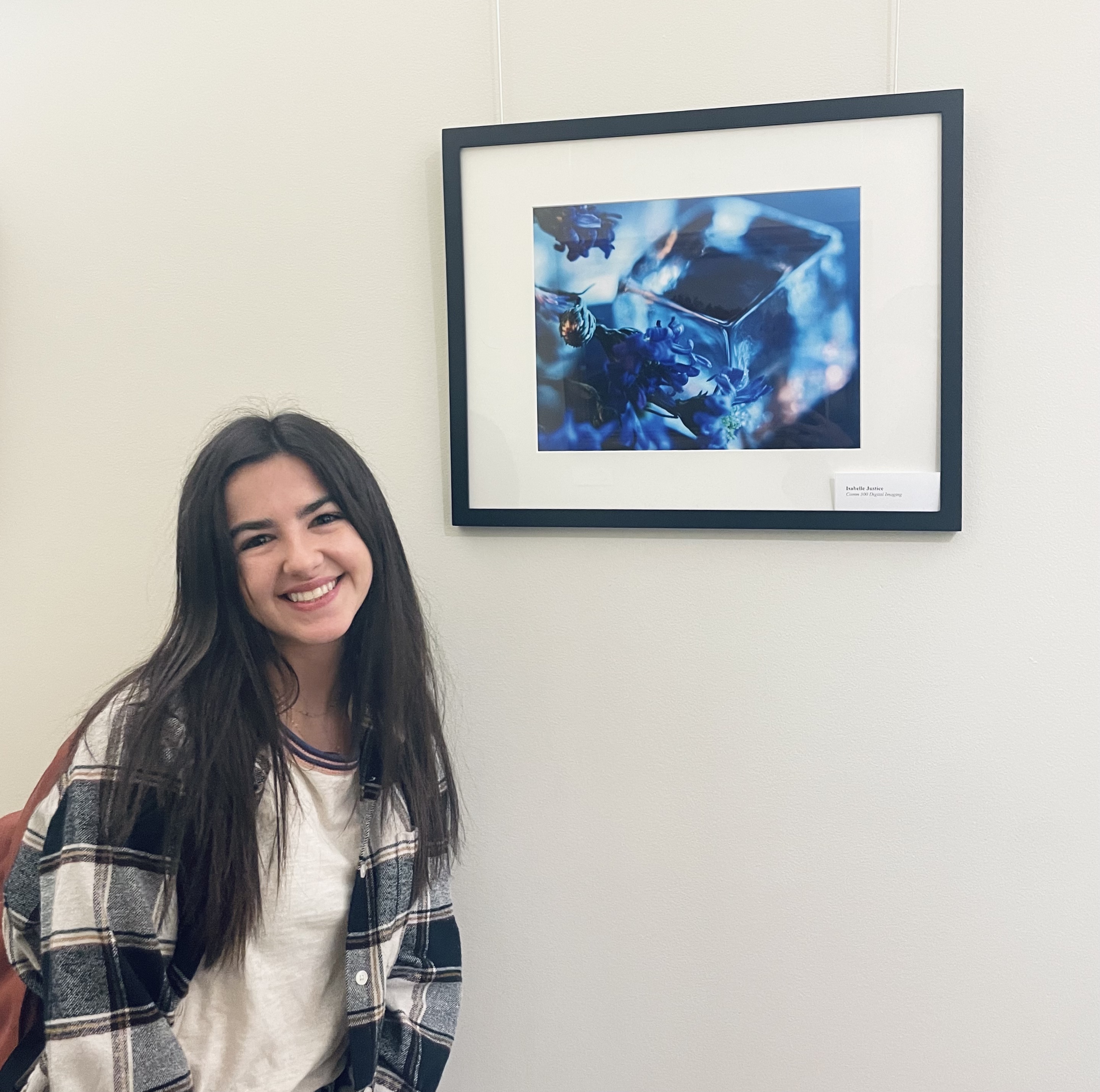
The final piece was mounted on metallic material and hung in the communication department building.
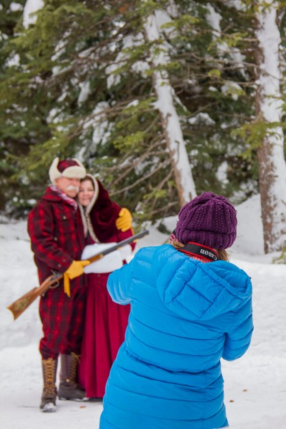
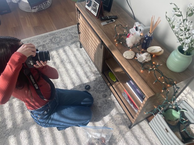
In our photo excursion to Island Park, Idaho, I was able to help the students in the Comm 300 Photography course with their assignments.
It was so much fun helping them enhance their photos! I helped them come up with creative ideas, such as a student walking through the river carrying a lantern with a long shutter speed, splashing water bottles in the river, and spraying water on indoor products.
In the process, I could see my understanding of cameras increase. I am so grateful for this trip!
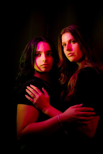
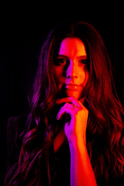
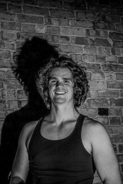
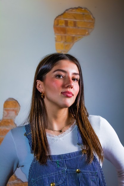
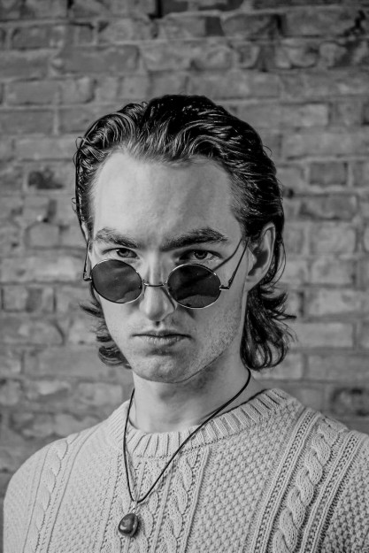
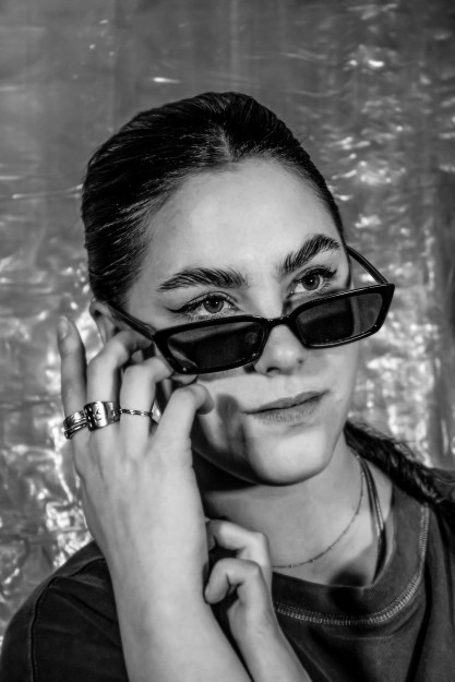
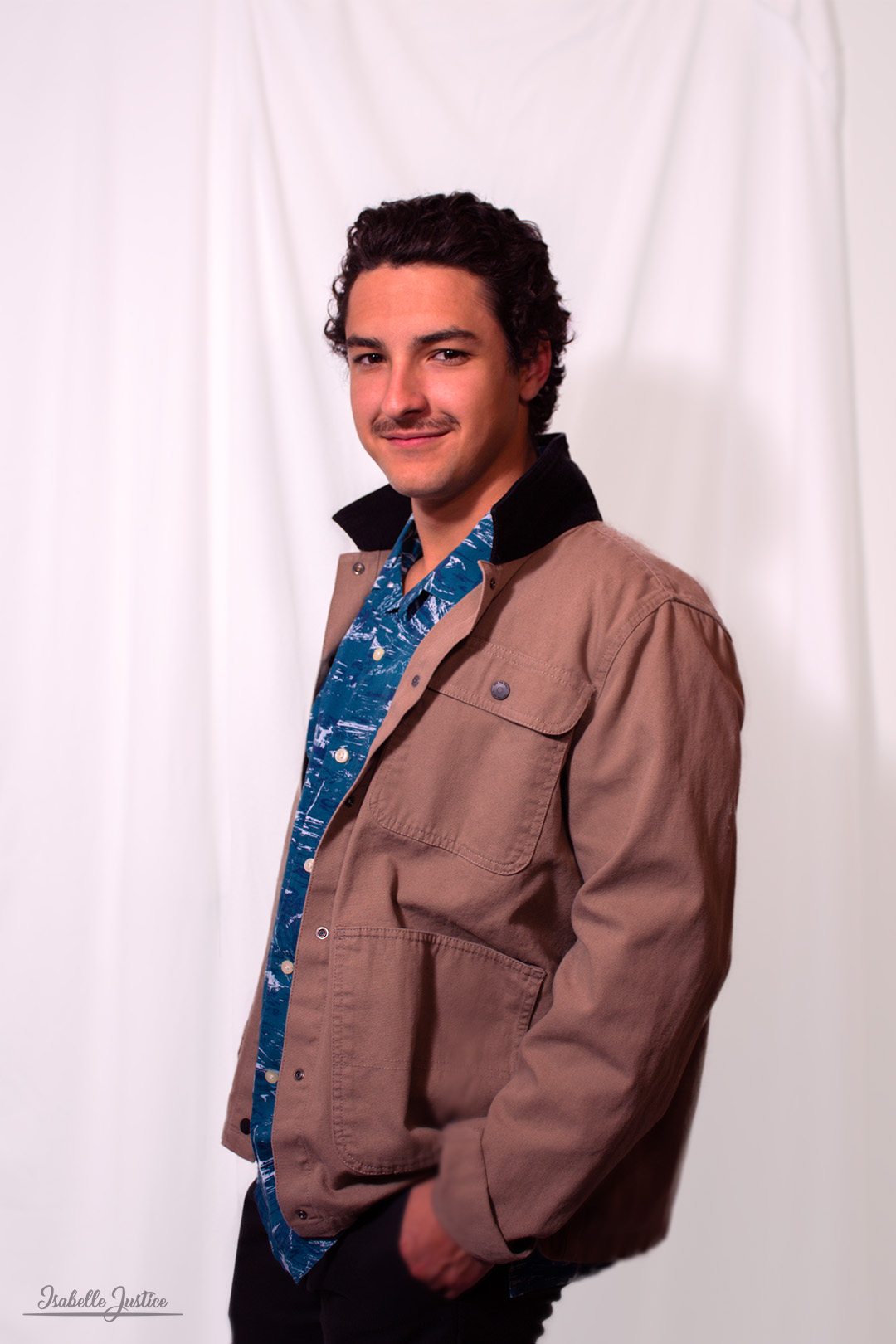
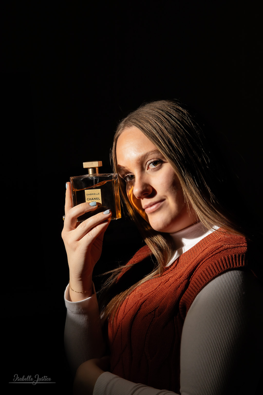
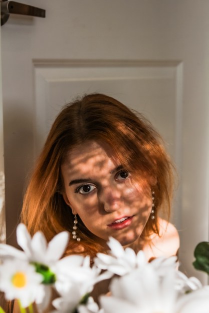
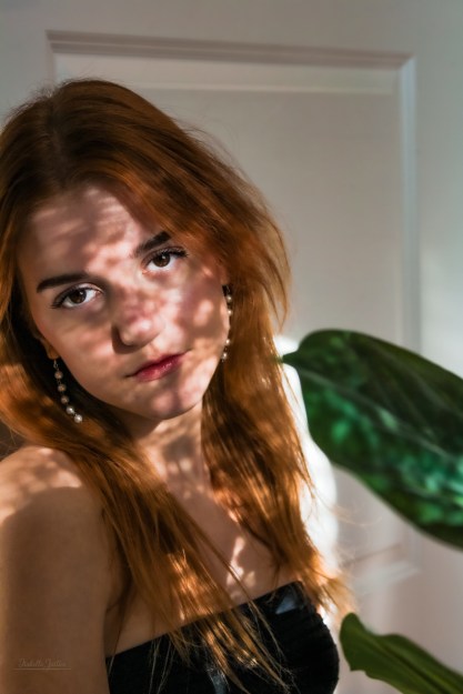
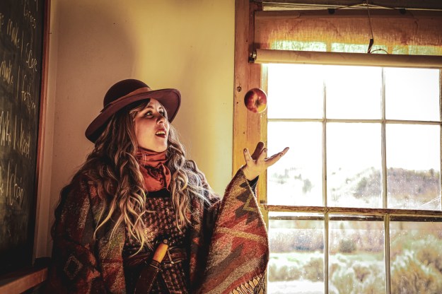
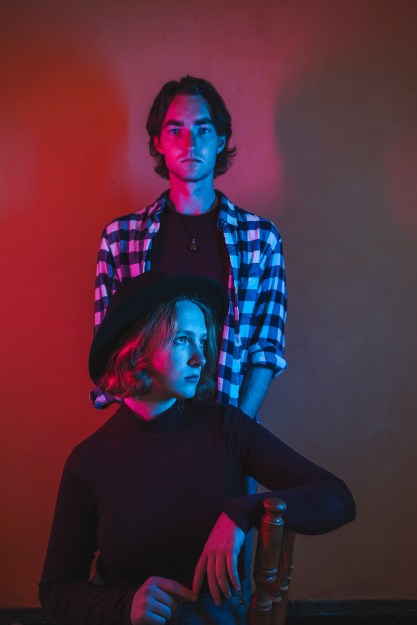
As part of Caryn Esplin’s photography course, we planned and participated in a fashion photoshoot. I had the privilege to take photos of nine talented female models and six wonderful male models. We covered portraits for men and women, as well as accessory and group photography.
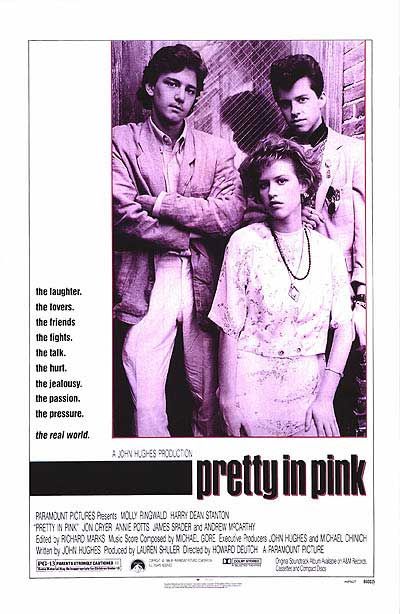
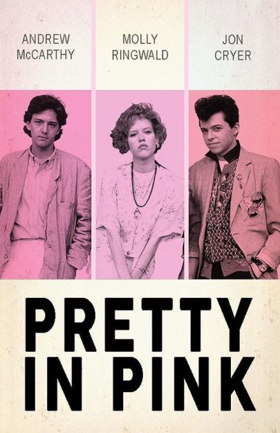
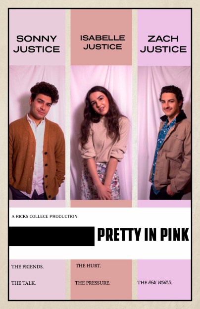
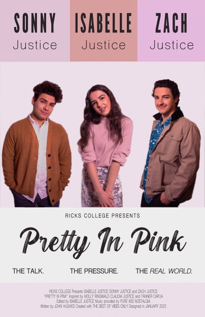
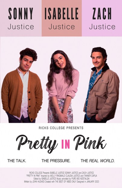
For this assignment, we were instructed to recreate a movie poster. I was determined to make this print something I am extremely proud of.
I decided to follow an 80’s classic – Pretty in Pink. I love the aesthetics of this film! I typically do my projects with blue or purple color schemes, but I wanted to see how well I could do with a color I have never played with before.
Final Product
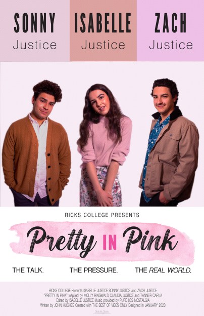
Here was my inspiration for this project.
Using a free font named “Blackout” from dafont.com, and a pink paint stroke .png file from pngitem.com, I elevated my design. I went through many drafts to make sure the final product was perfect. Finally, I took my InDesign file back into Photoshop. Here, I added a mask to remove the white backdrop, a halftone effect, and the healing tool. I am so proud of how this turned out!
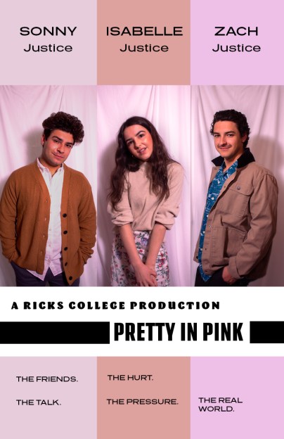
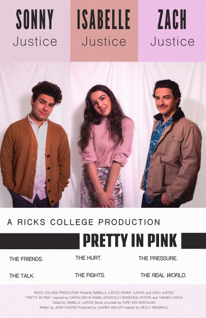
Click through the slideshow to see my editing process from beginning to end.
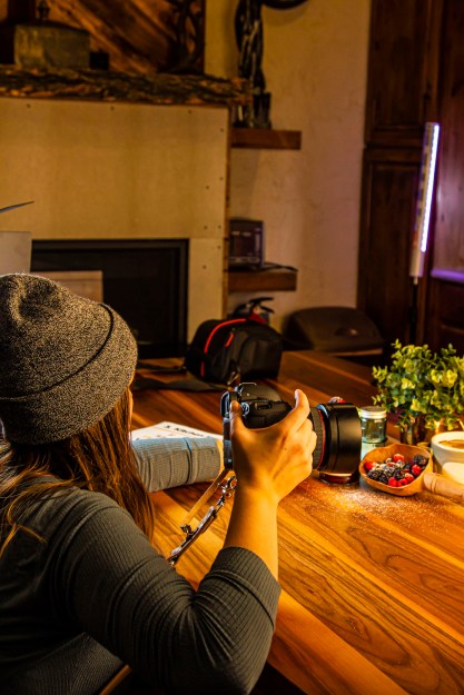
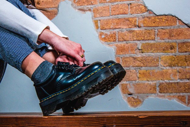
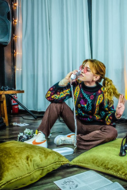
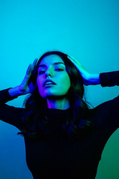
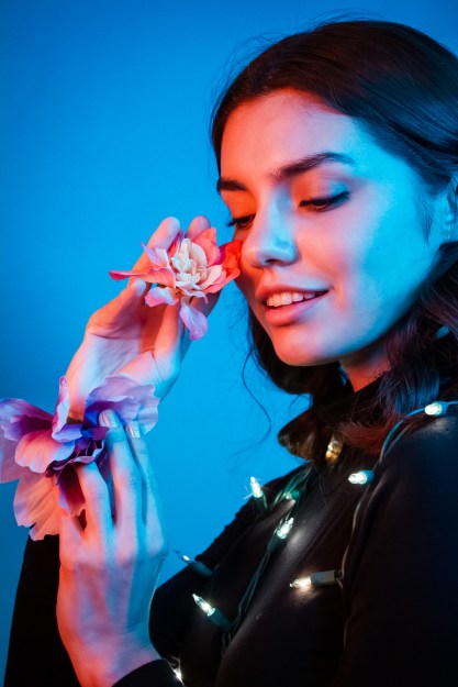
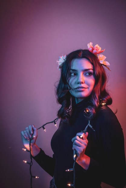
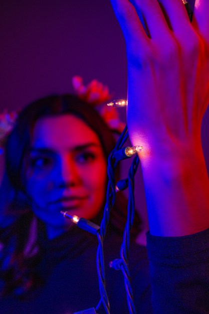
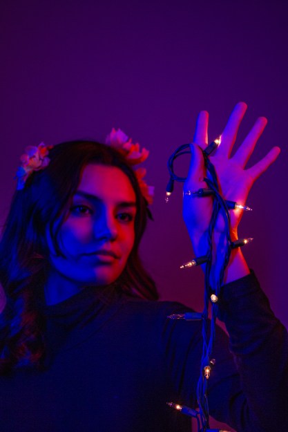
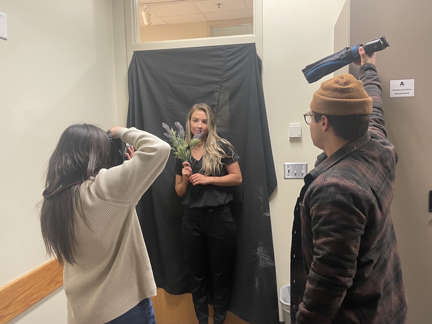
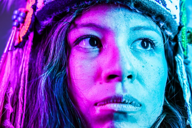
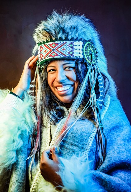
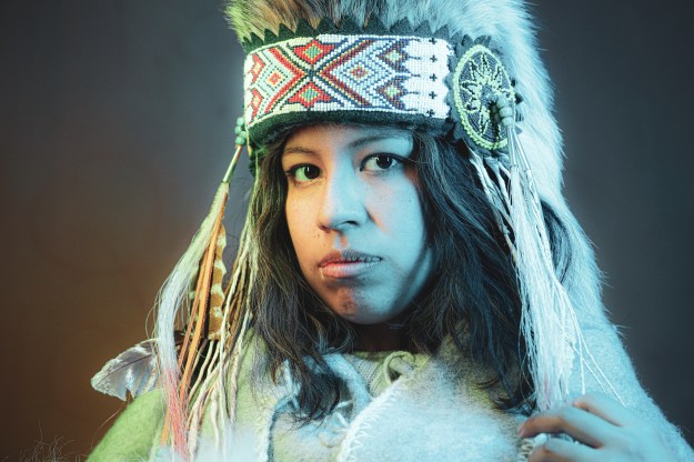
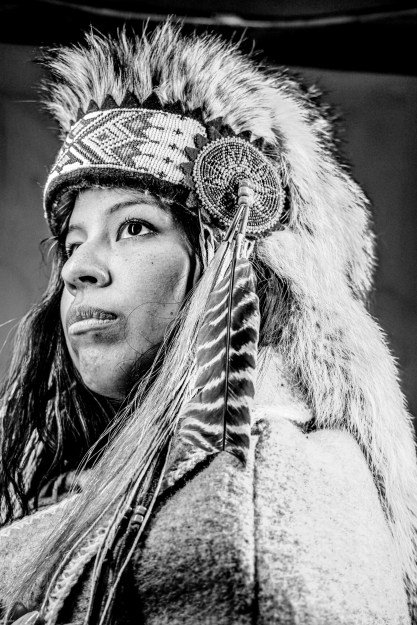
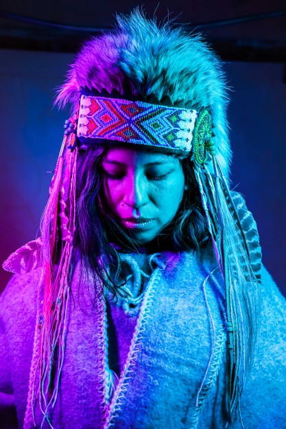
This week, we learned how to use a light kit in our photography. We focused on a technique called SQIBB, also known as “Studio Quality Invisible Black Backdrop”. To accomplish this, we learned how to set up a light kit, use a trigger, and use a snoot.
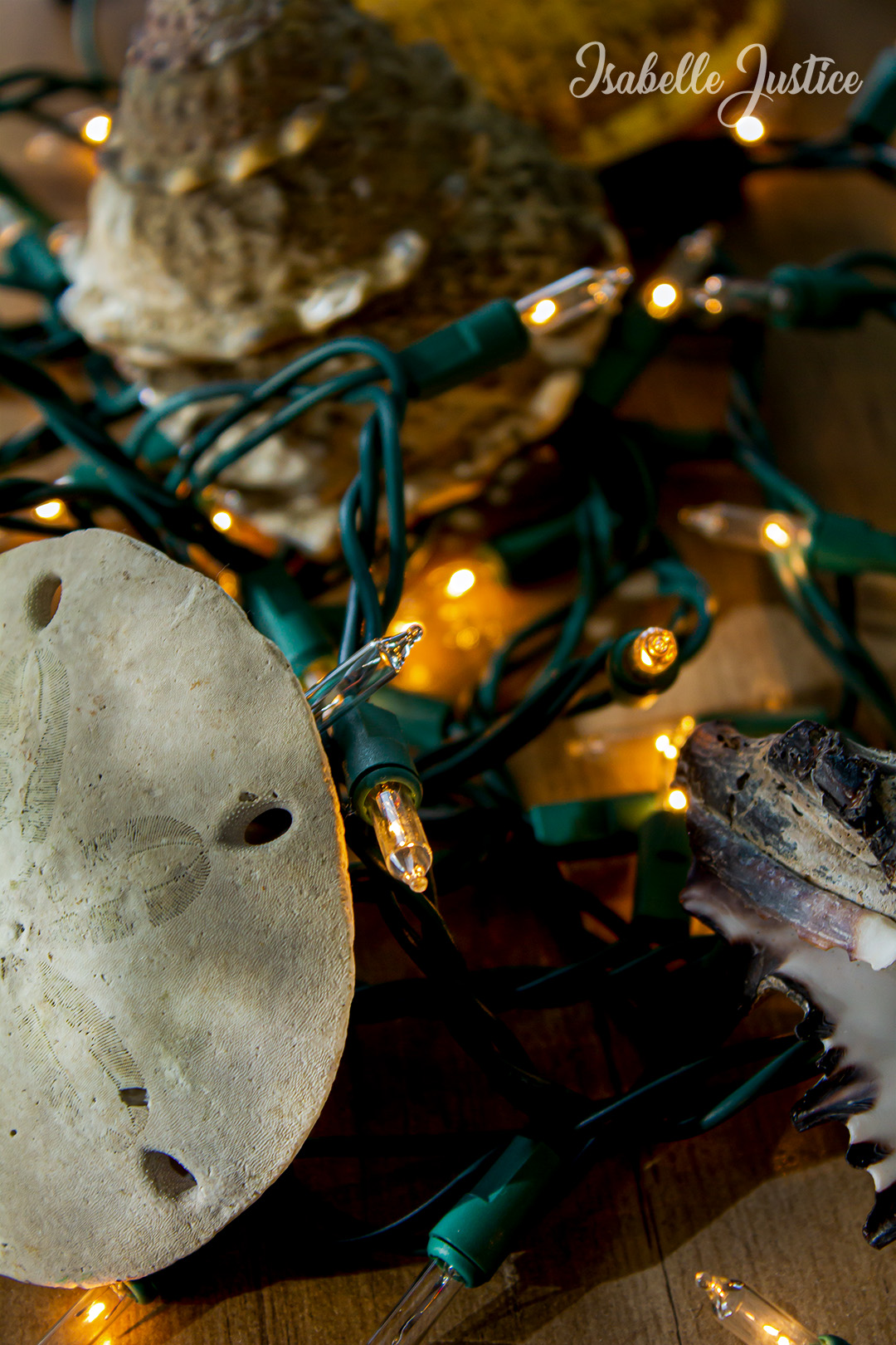
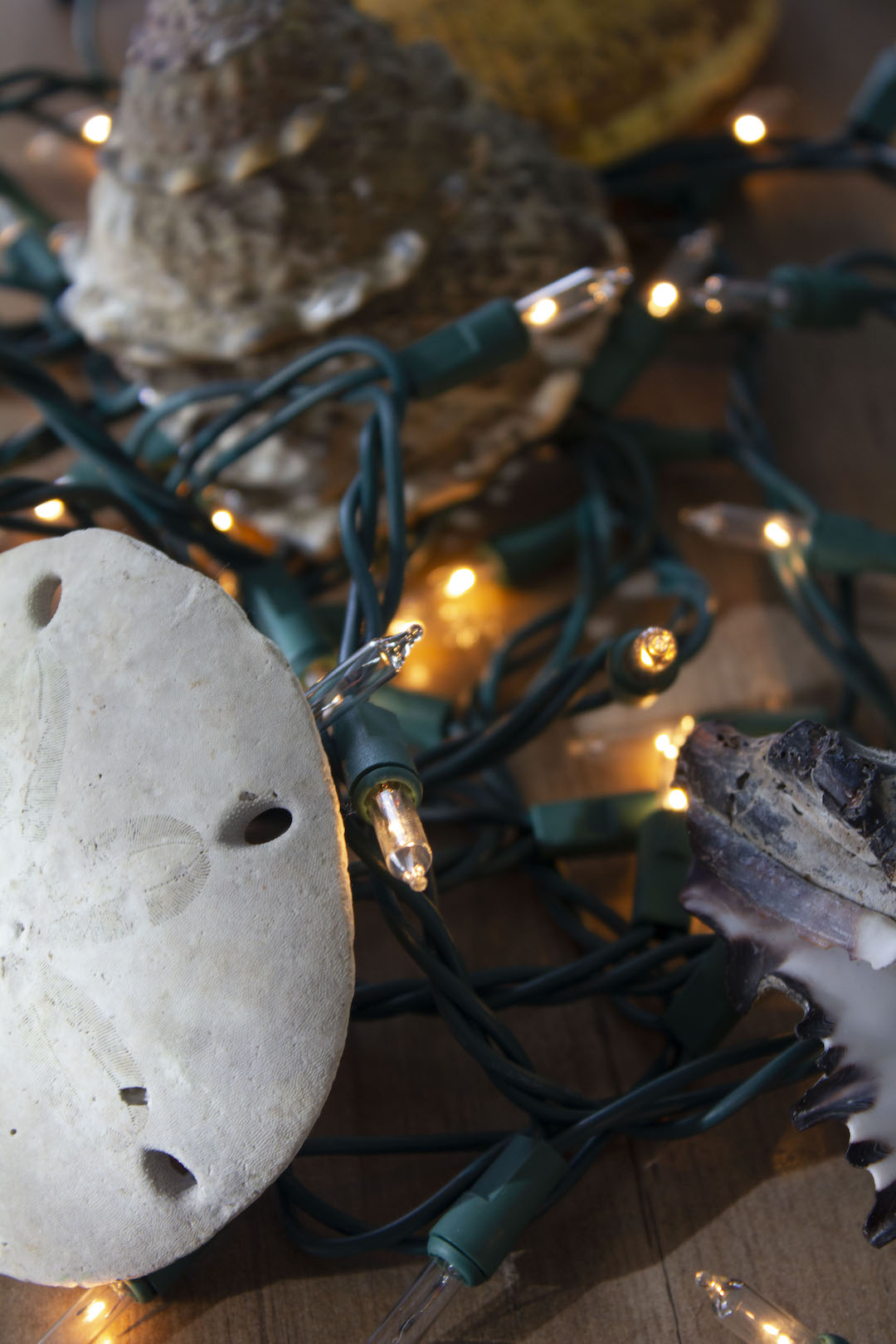
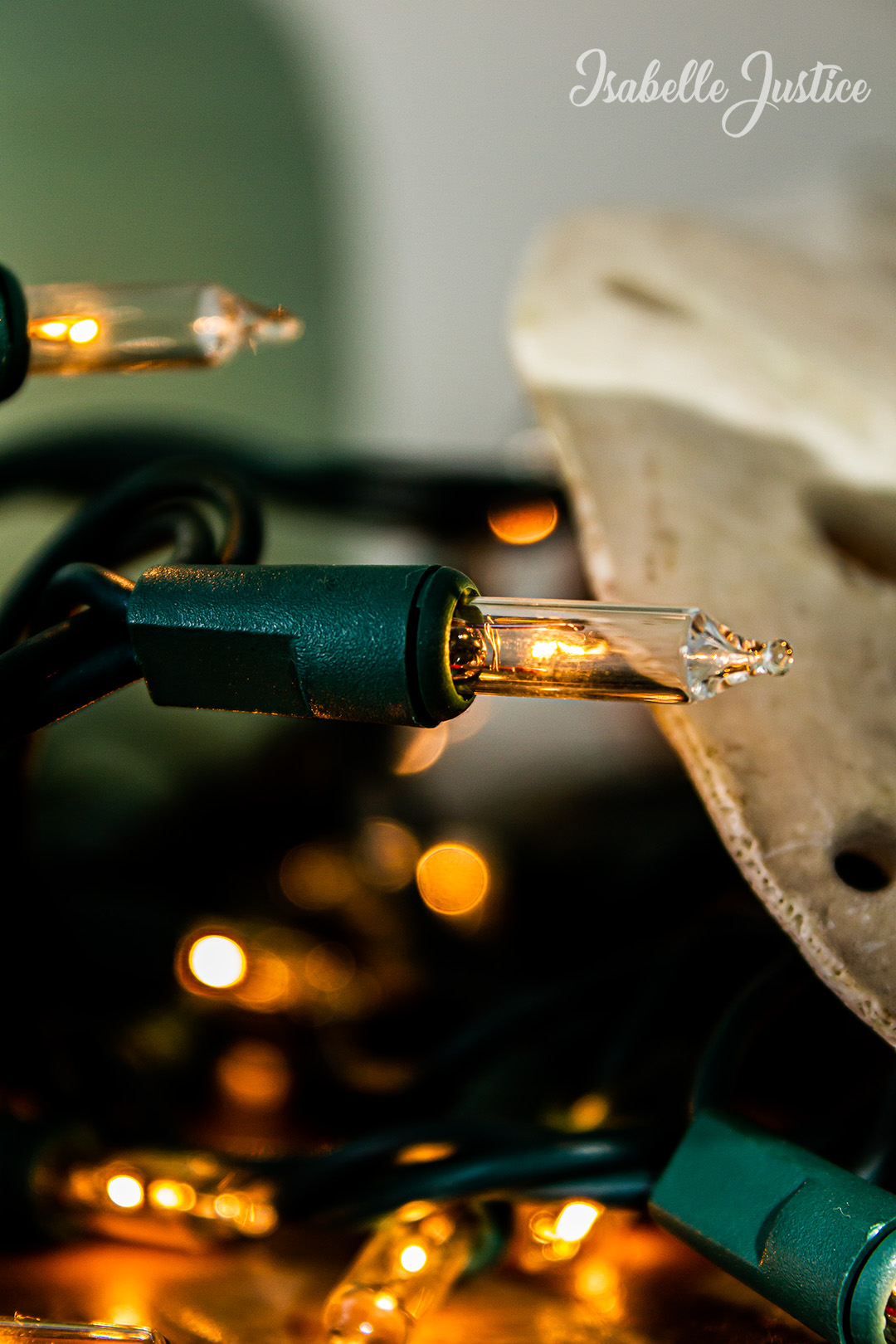
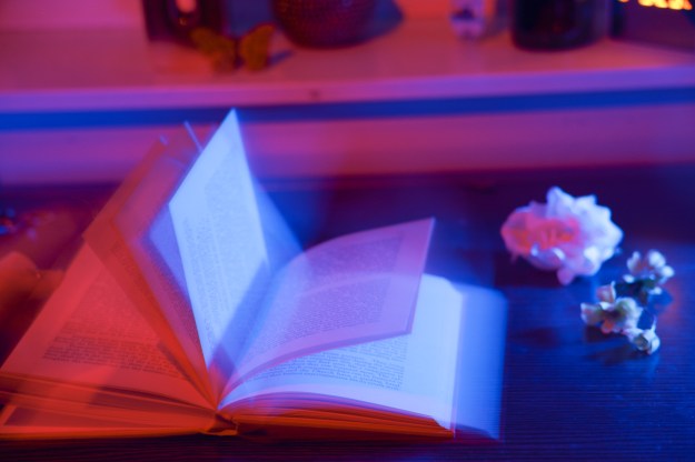
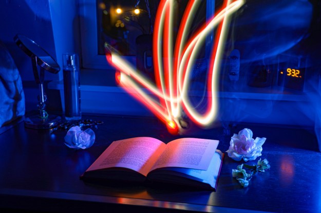
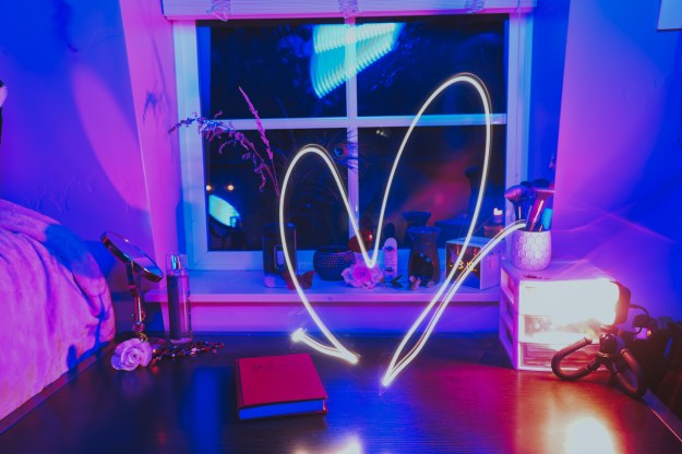
For our first photography assignment, I wanted to apply my creativity with the things I already have. In a world saturated with advertisements, media and easy ways to spend money, we can forget to be grateful for the things we already have. For my OSES project, I wanted to apply just that.
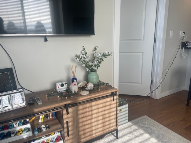
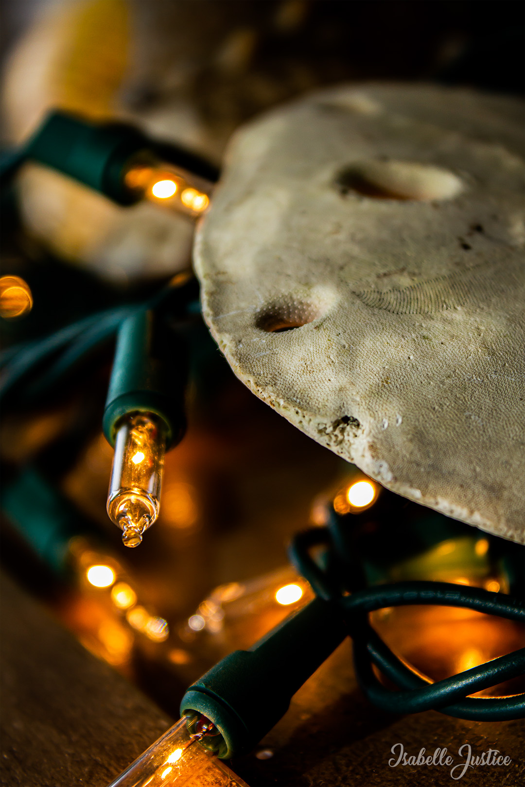
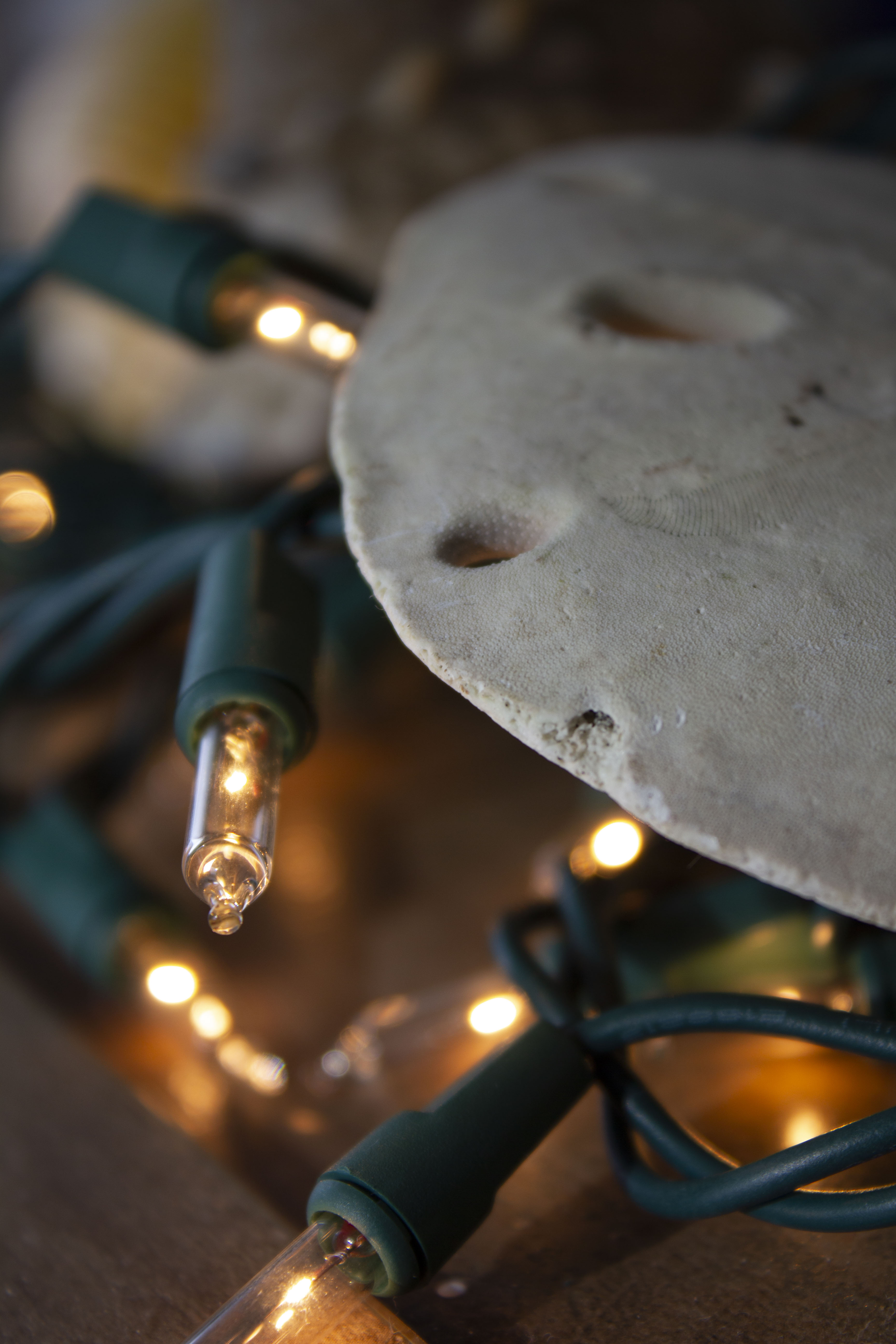
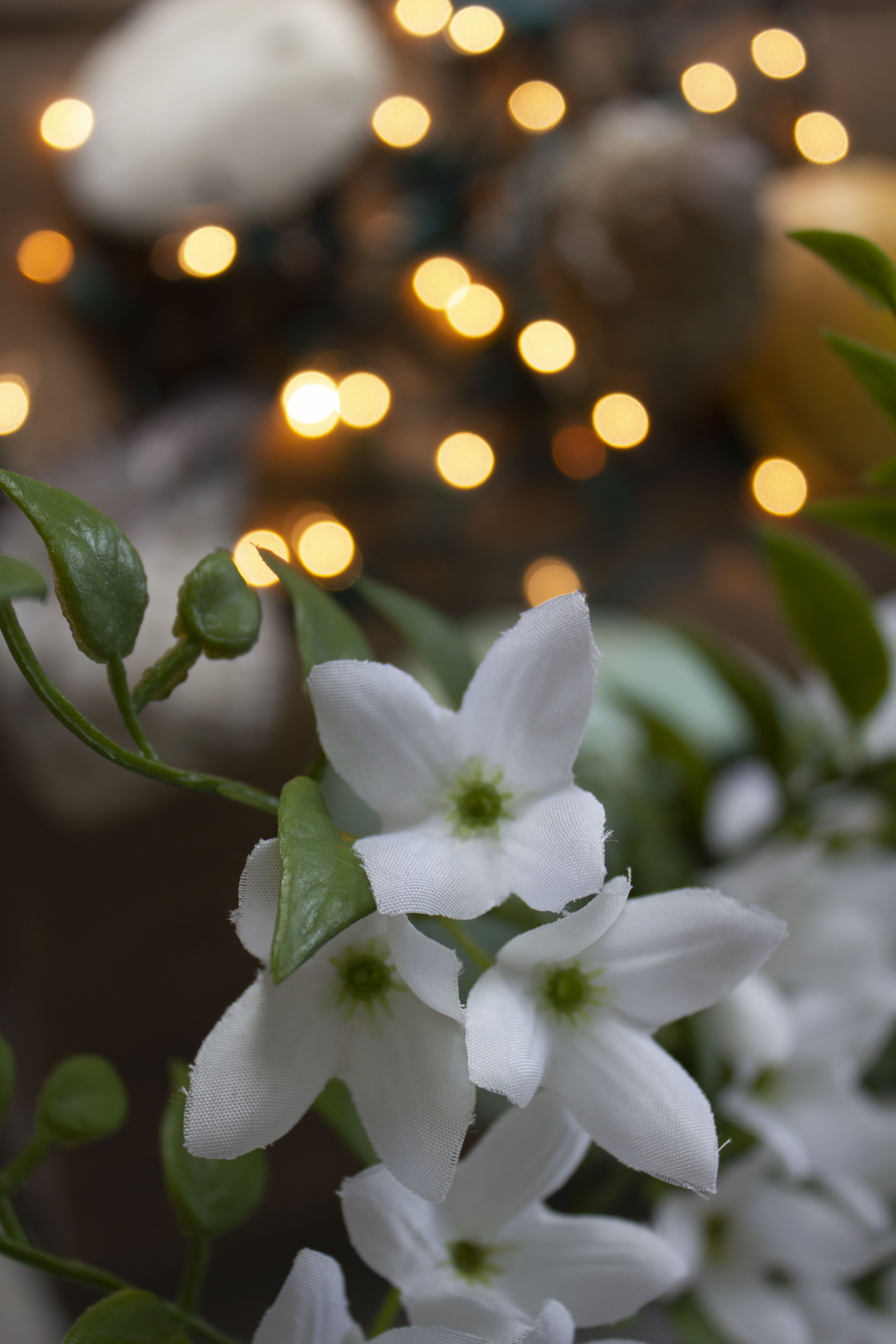
For those who don’t know, OSES stands for “Ordinary Spot, Extraordinary Shot”. This means taking your photos in an “ordinary” or boring spot and making them spectacular. With Christmas just last month, I still had some flashing lights I had in mind to use as props. Over the summer, my family and I went to Mexico and collected seashells. With the treasures I already had in my home, plus other knick-knacks, I could make an ordinary spot in my apartment extraordinary.
Original Set-Up & Editing
The editing process was rather simple! I used sliders in Camera Raw, such as temperature, exposure, contrast, highlights, shadows, textures and clarity. I took things a step further into Photoshop by dodging and burning and applying a final “Levels” filter. I also applied “Smart Sharpen” and my watermark.
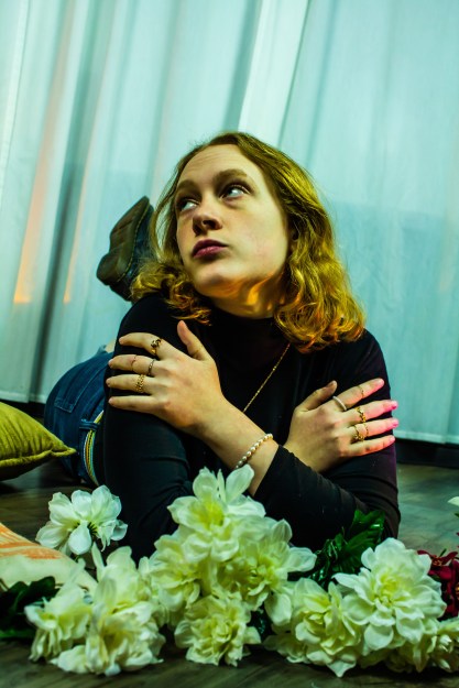
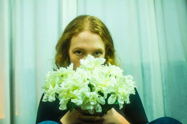
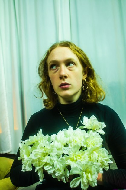
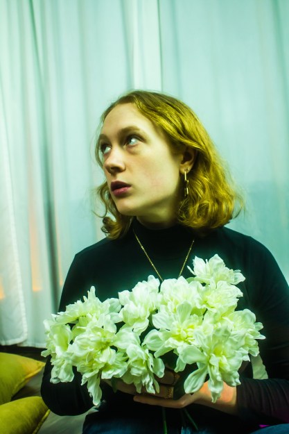
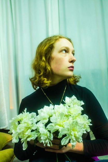
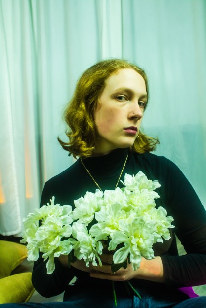
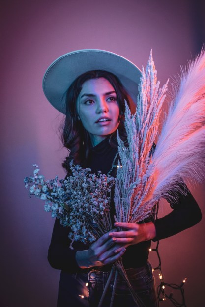
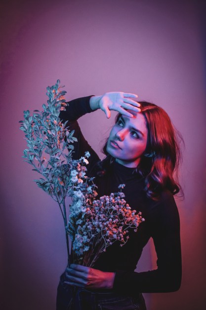
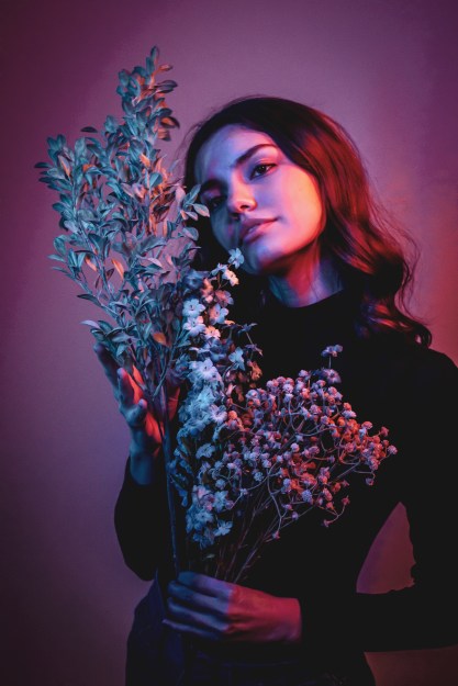
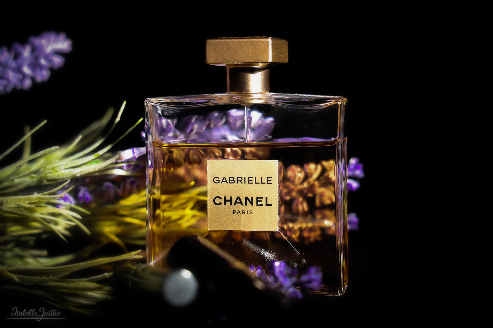
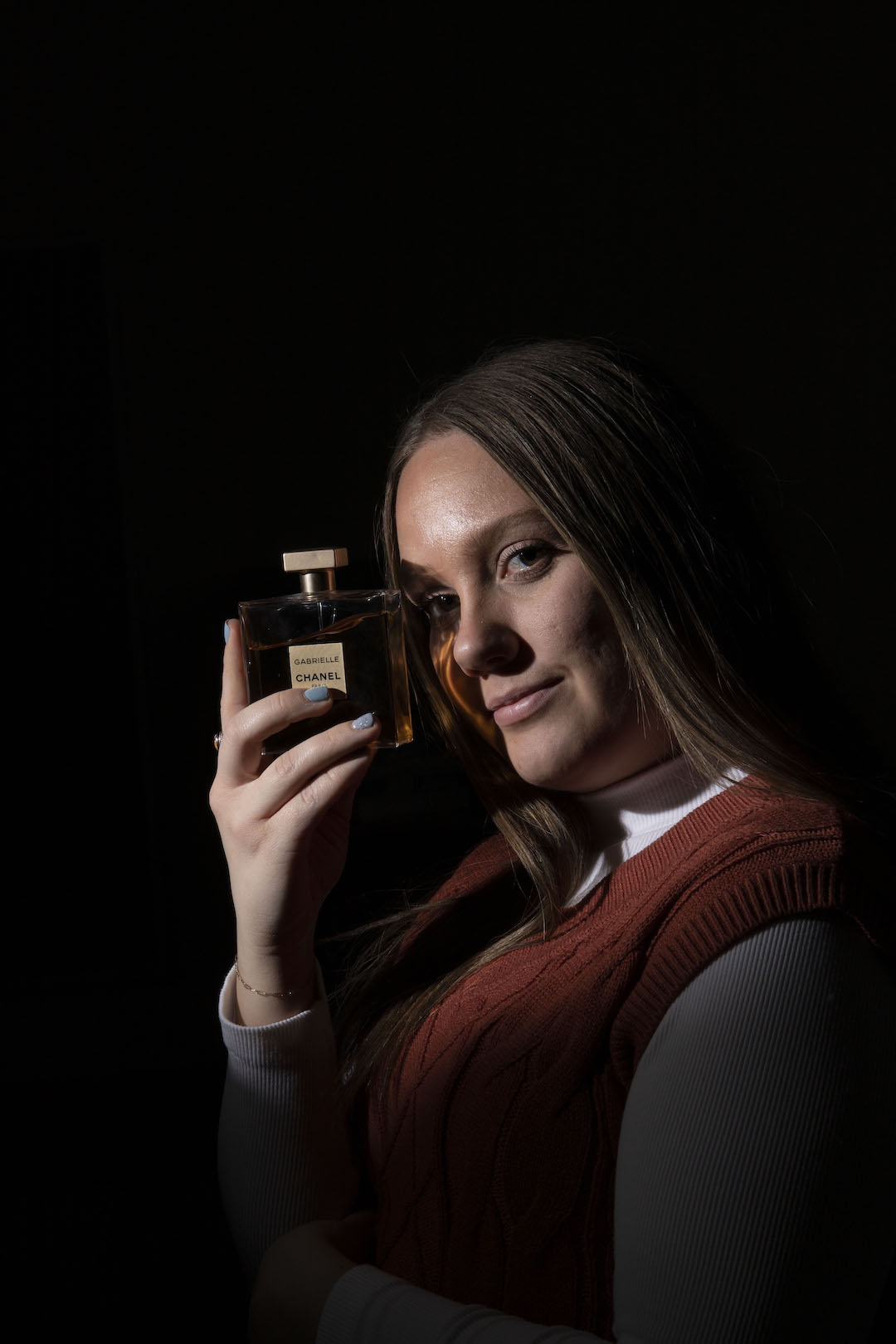
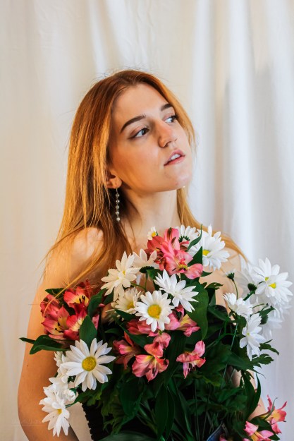
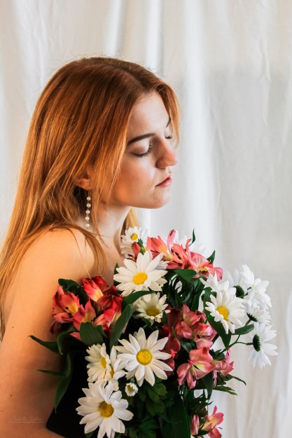
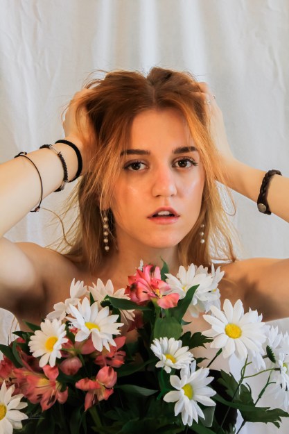
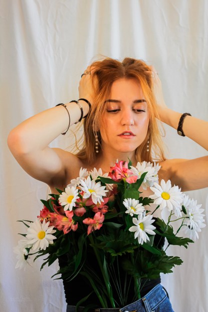
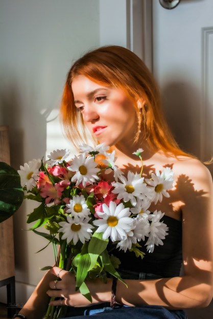
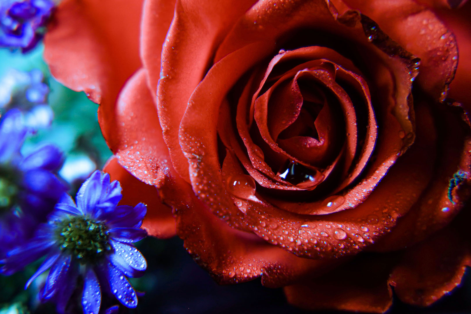
For these shots, I used a white backdrop, light kit, and gold diffuser. My model brought flowers, and I purchased some more to incorporate contrast.
In Camera Raw, I decreased the texture and adjusted the lighting. In Photoshop, I smart-sharpened, used a Gaussian blur mask, and used the healing tool to emit some of the distracting wrinkles with the backdrop. I then used Lightroom to create presents for this shoot and altered them individually on each photo.
I was worried the photos would be too dark to fix in post-production, but I was pleasantly surprised. I used plenty of dodge and burn to make the images more interesting.
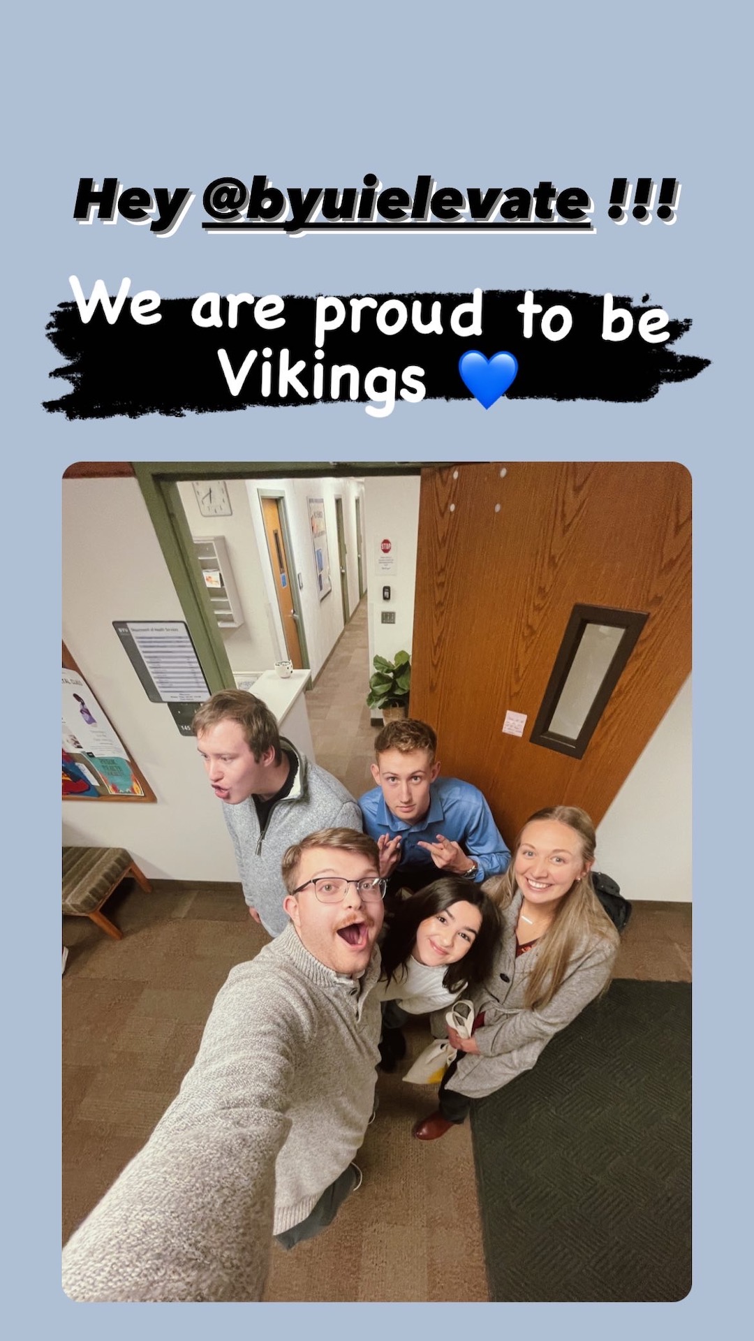
Elevate is a campus-wide competition at BYU-Idaho. Students from different majors get together and present a project to a set of judges. The purpose of the project is to create something that will improve the campus experience. Each semester, Elevate has a different theme. This semester’s question was: How can we achieve unified discipleship amidst, diversity, distance and difference?
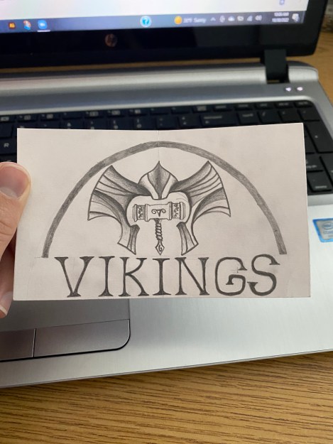
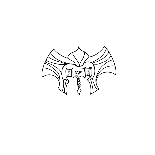
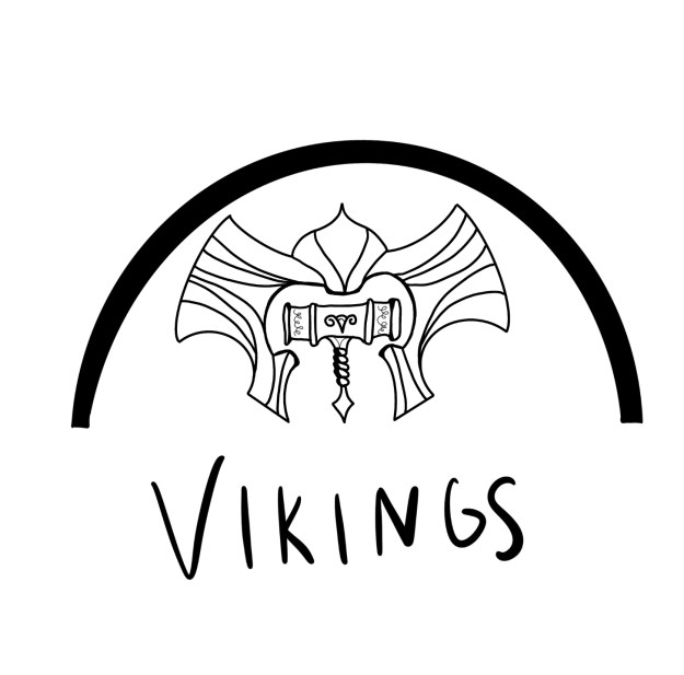
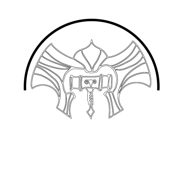
As we competed in the Elevate competition, our group discussed the concept of unity and connection. Why are students at BYU-Idaho so disconnected? What makes this university so different than others? My group studied the difference between BYU- Idaho and Ricks College and noticed the biggest difference – the lack of a mascot. We proposed that BYU- Idaho should reintroduce the Viking Mascot digitally. This will increase school spirit and unity among students, all while spending little to no money and providing networking and internship opportunities for students.
Reintroducing the Viking Mascot, known as Thor, can bring new opportunities to students in the form of design practice, internships, and overall student connection. The Viking Mascot can be implemented in BYU-I social media and merchandise, including but not limited to, the University Store. Hashtags can also be used online to increase school spirit.
The skills that I used for this Elevate project were my graphic design and writing skills. I wrote the abstract our group submitted as well as formatting the Google Slideshow. I also made the mockup Viking logo, which took a sufficient amount of time. I spent about 12 hours on this project, according to my tracking journal. I felt that my team was really connected and worked hard. Even though we all had busy schedules, we made our Elevate project great!
During the performance, I presented the slides that went over the logo design process. I talked about how the logo will help the school in three ways: internship opportunities, campus involvement through a student logo competition and new merchandise for the university store, bringing in new income and excitement from students.
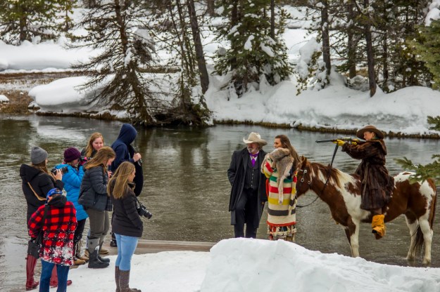
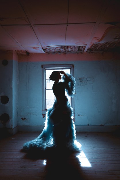
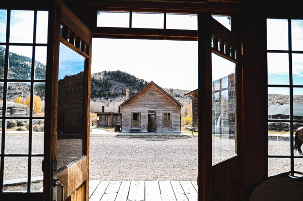
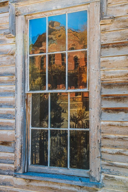
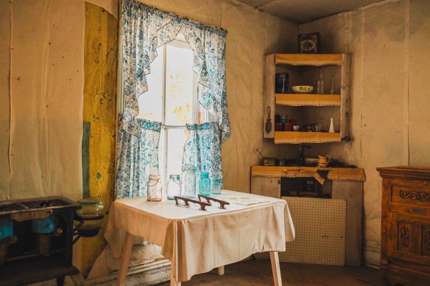
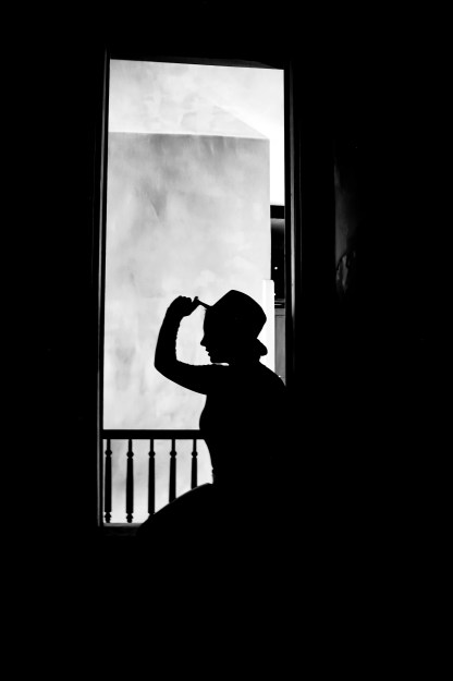
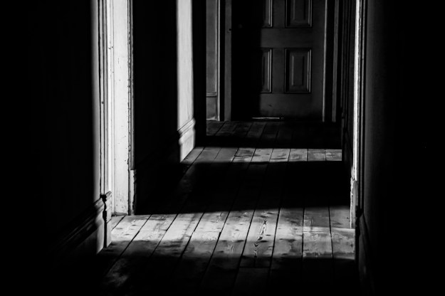
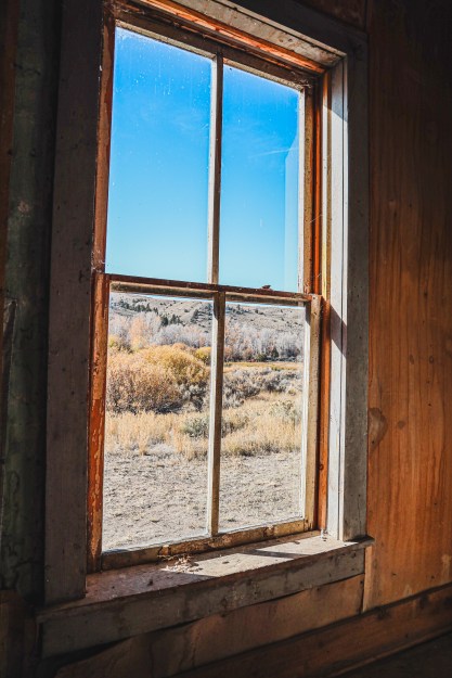
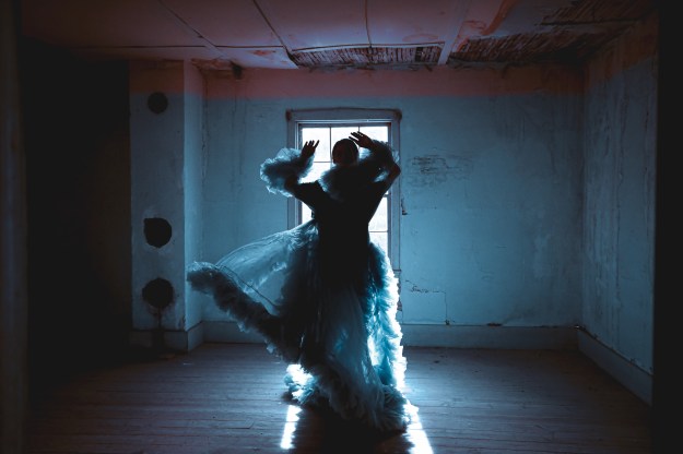
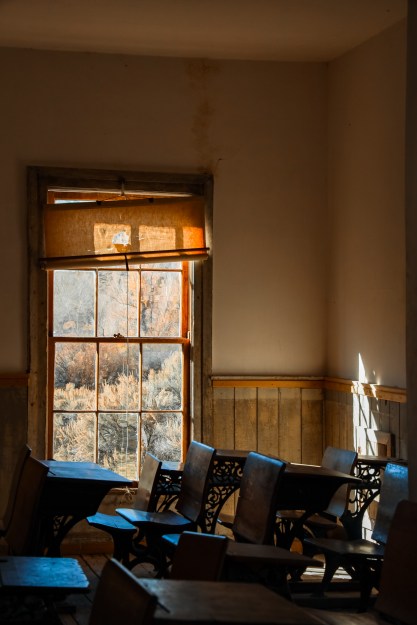
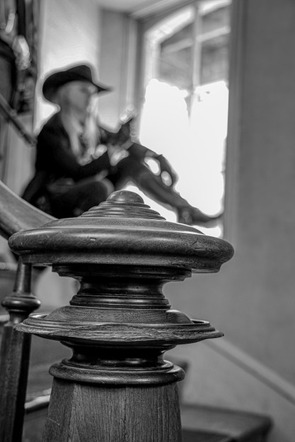
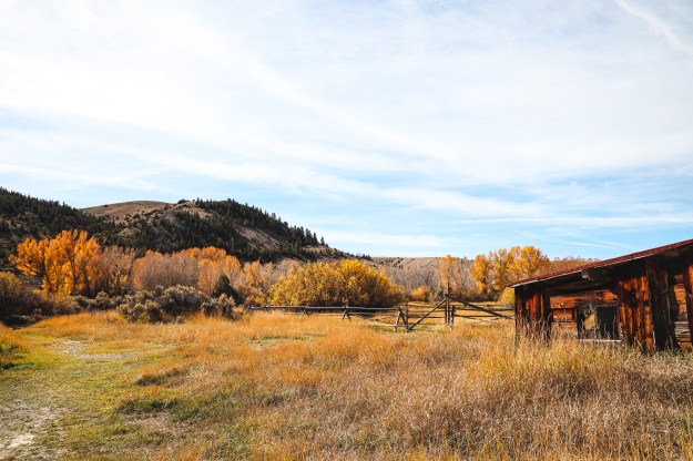
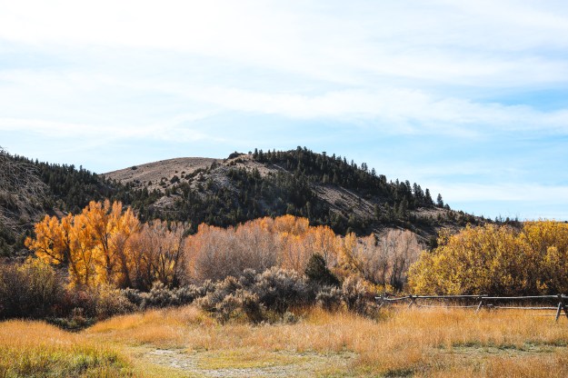
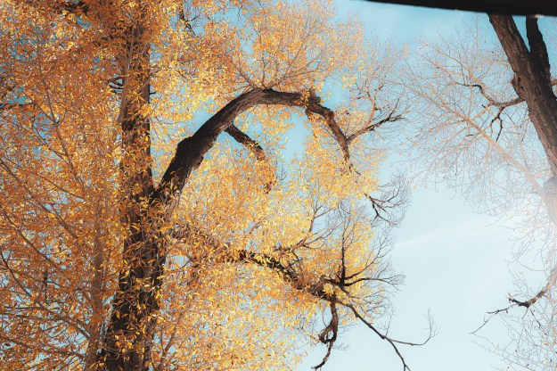
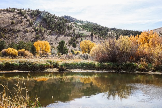
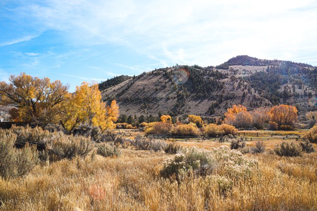
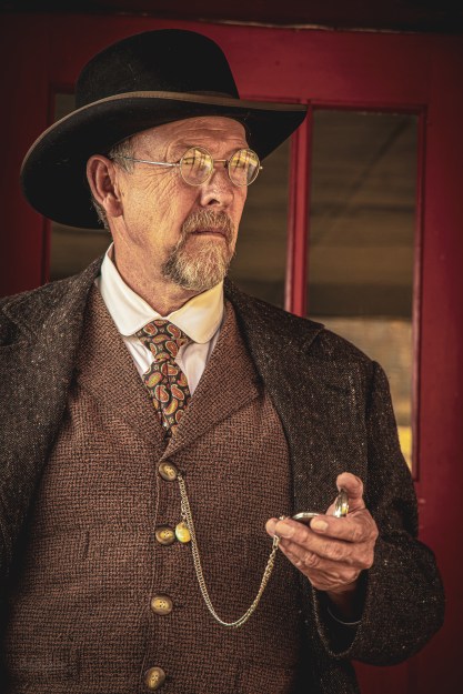
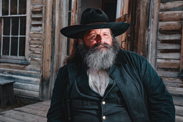
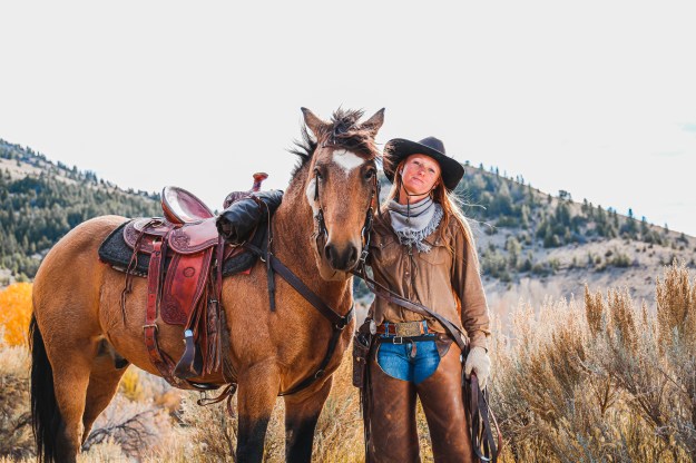
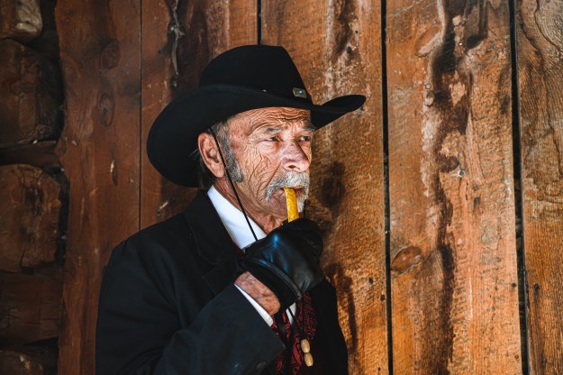
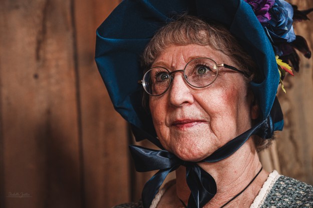
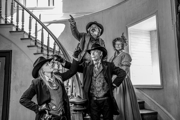
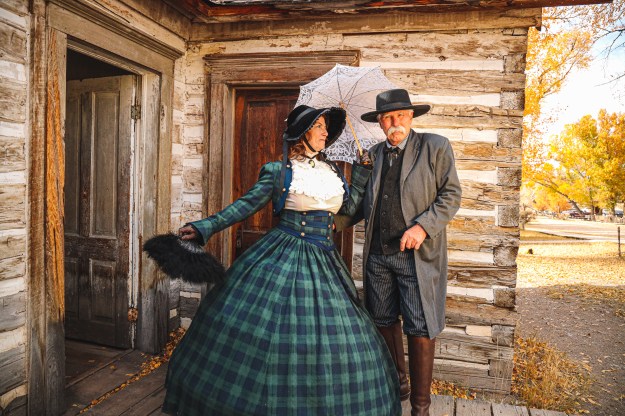
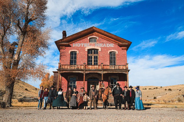
For Caryn Esplin’s Digital Imaging course, we participated in a photo excursion to visit a ghost town in Bannack, Montana.
Even though this town is abandoned, I felt at home because there was so much character to explore. I am so grateful for the visitors who still come and the models who truly bring Bannack back to life.
Fine Art
The first photo in this gallery won a class and a Shoot The Frame award.
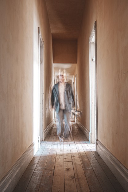
This is my very first photography project where I understood how to use the manual options of a camera, such as shutter speed and ISO.
I have never done light painting before, and this was something that I always wanted to try. I had a lot of fun setting up the scenes for my projects, and learned just how much fun photography can be when you have someone to help you.
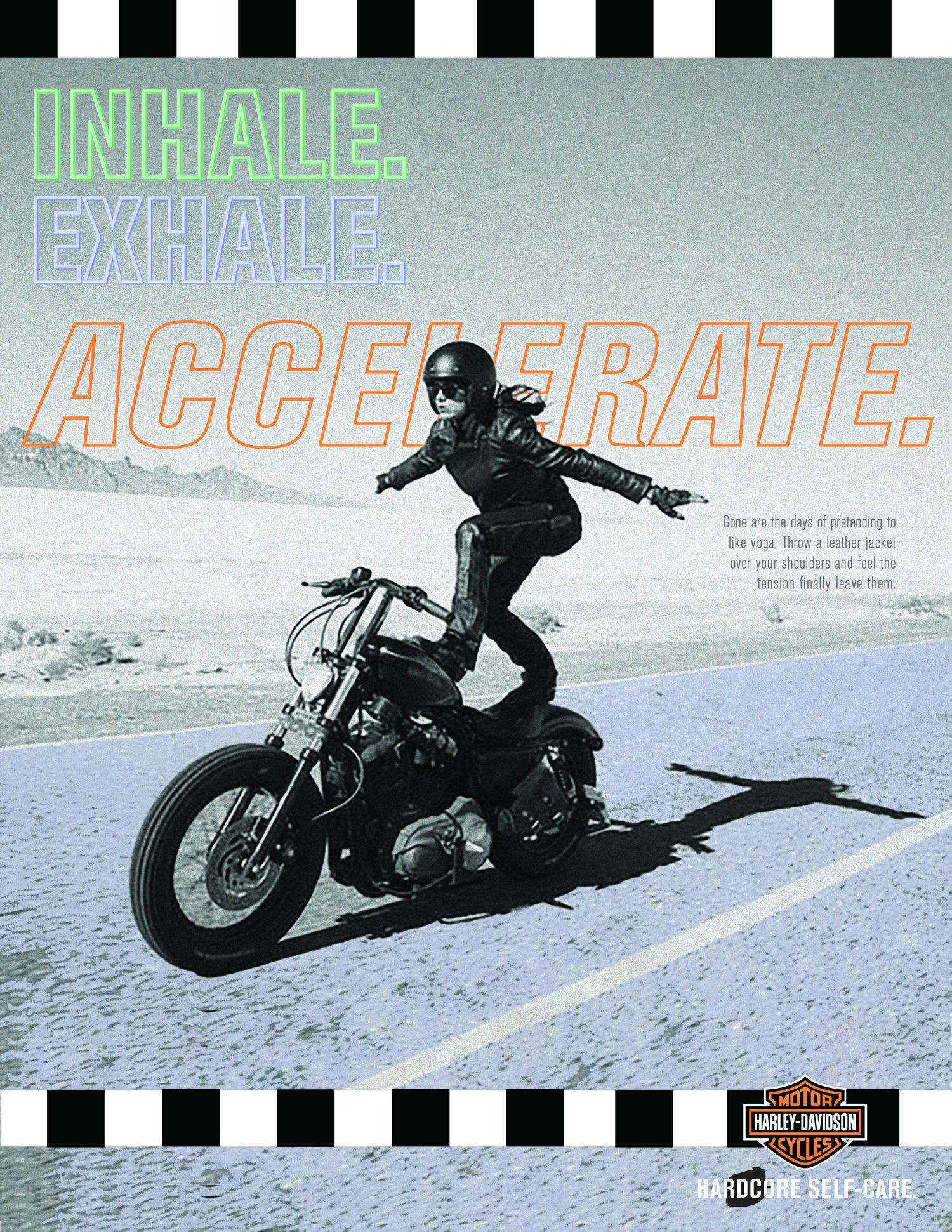
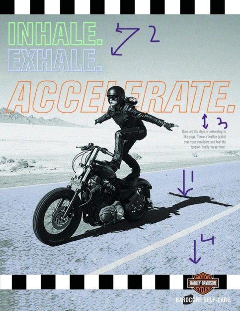
For a school assignment, I was asked to create an advertisement. I wanted to choose an advertisement for something that I was interested in and had ties to. What better way to accomplish this than an advertisement for Harley riders, being that my parents are avid Harley fans?
I did a quick Google Image search and this was the ad that popped up. The Creative Circus, an art college in Atlanta, Georgia, created an ad campaign for Harley Davidson, focusing on motorcyclist women, self care and the freedom that comes with the sport. They had two other ads that went cohesively with the original photo, but did not include a motorcycle. That is where my inspiration came in.
Original Ad Analysis
There are so many design elements that I love about this advertisement. The first arrow shows contrast because of the black shadow, grey background and blue road. The black sticks out from the blue and draws your eyes to the woman. There is also contrast among the black and white boxes lining the top and bottom.
The second arrows points to repetition, where the same fonts are used to get the ad’s point across.
The third arrows reference proximity. The main focus of the ad is to “accelerate” and the descriptive text is right aligned and in a smaller font, showing that it is less important.
The fourth arrow points to the logo and refers to proximity. This is because the logo is important, otherwise it would be hard to know what the ad is for. However, it is not the most important part of the piece, the female motorcyclist is.
I also love the color choices of “Inhale. Exhale. Accelerate.” The “Accelerate.” is the classic Harley Davidson orange, and I think the blue and greens blended together well with the color of the motorcyclist, road and background. I also enjoyed the typography of “Accelerate.” because it is slightly italicized compared to the first two words. I love how there was only a stroke for the text because it shows off the photography well.
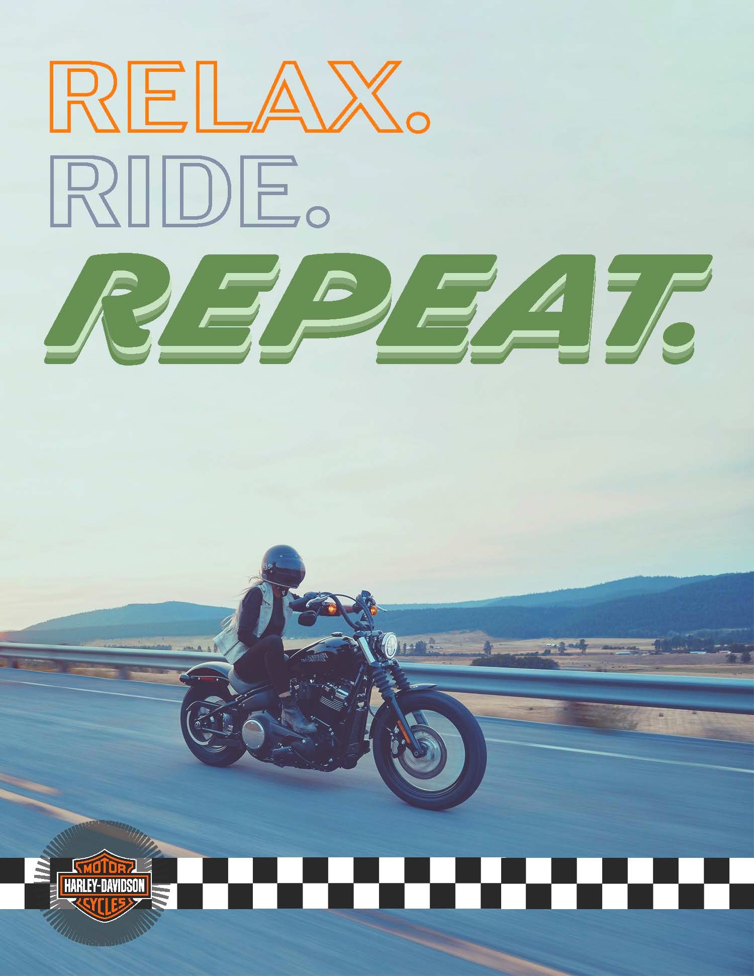
New Advertisement
For my Campaign Ad, I wanted to do another female motorcyclist ad. I flipped the photo to face the opposite direction and incorporated colors of purple and maroon with hints of light blue rather than the blue and grey combo from the original ad. Arrow 1 shows contrast. I edited the photo’s colors to make the woman a dark maroon to pop out from the light background. Arrow 2 points to repetition. I made opaque boxes overlapping each other for the design aspect. I added it to the bottom right corner to create flow in the photo. I use Harley Davidson orange for this design. Arrow three points to alignment. The tagline was left aligned and I made the top line bigger than the bottom because that was the main message I wanted to portray. Arrow 4 points to the logo and refers to proximity of the logo. Like the original ad, the logo was important but the main focus is the motorcyclist so it was left aligned to the bottom. Typography wise, I created a darker shadow for the bottom line, creatine dimension.
Conclusion
At the end of the day, I wanted these two ads to be cohesive without copying each other. I think the color choices are similar but different enough to be two different advertisements. I enjoyed playing with the colors of my original photos as well was creating background designs in Illustrator. I love the company as well as the message of the ads.
For one of my classes, I was tasked to create a magazine spread based on an article online. These are my photos that I took in Alta, WY. I loved this project because this is the first magazine spread I’ve created that I am very proud of!